Pie chart
Pie charts show categories as a proportion or a percentage of the whole. Use pie charts to show the composition of categorical data with each segment proportional to the quantity it represents.
When do you use it?
Pie charts are effective when comparing parts of a whole for a static period. They do not show change over time.
Consider using a pie chart if you are working with:
- one data set pie charts are effective for categorizing and comparing one data set
- positive values pie charts cannot display zeros and can be confusing when working with negative values
- seven or fewer categories it becomes increasingly difficult to perceive the relative size of each segment when working with more than seven categories
Examples
Standard pie chart
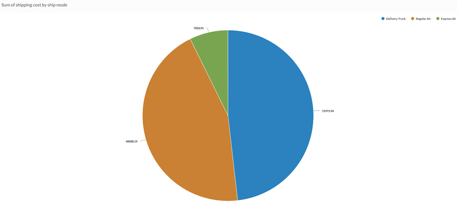
You need to determine which shipping methods represent the greatest total proportion of the total amount your organization pays in shipping costs. Using a pie chart, you demonstrate the percentage of total cost that each method represents:

Donut chart
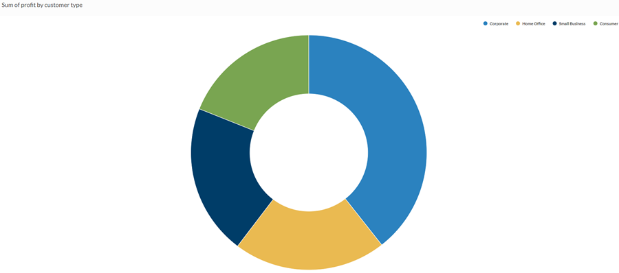
You need to determine if there is a relationship between customer type and profit. Using the pie chart, you display the sum of profit for each category of customer to show which customer types represent the most important segment of your sales:

Data configuration settings
On the Configure ![]() panel, click Data and configure the following settings:
panel, click Data and configure the following settings:
| Setting | Supported data types | Description |
|---|---|---|
| Categories displayed |
|
The field represented by pie chart sections. One section is created for each unique value in the field. |
| Value | numeric | The aggregate value that serves as the basis for the chart's values. The total of all values in the field for each category determines the size of the pie chart sections. |
Chart display settings
On the Configure ![]() panel, click Display and configure the following settings:
panel, click Display and configure the following settings:
| Setting | Description |
|---|---|
| Options | |
| Show Legend | Show or hide the legend at the top of the chart. |
| Show Values | Show or hide the data point values. |
| Show Percentages | Show or hide the percentage that each proportion represents of the whole. |
| Donut | Display the pie chart as a donut chart rather than a traditional pie chart. |
| Ratio |
Controls the size of the donut hole in relation to the chart as a whole. Specify a larger value to increase the size of the hole. The maximum value is 0.7. |
| Other settings | |
| Colors | The colors assigned to each category. |