Heat map chart
A heat map is a graphical representation of data where the individual values contained in a matrix are represented as colors. Data points are defined by an x and y axis intersection and a third value that determines the data point's color.
When do you use it?
Use heat maps to compare variables across a large number of categories and to sort complex data by color intensity.
How does it work?
Data values
Data values appear as boxes on the heat map. The size and color of each box are determined by the data for that item:
- size determined by the concentration of x and y axis categories and is not configurable
- color determined by the calculated value specified in the Color by setting
Gradients vs stepped colors
By default, the lowest values are colored green, the mid-range values are colored yellow, and the highest values are colored red. Colors are fully customizable.
Data points are colored using one of the following display setting coloring schemes:
- color gradient continuous change from green, through yellow, to red following individual data values
- stepped color scale data values grouped into equidistant categories and displayed using discrete colors
You can customize the number of steps used to group the data values in chart the display settings.
Examples
Heat Map chart
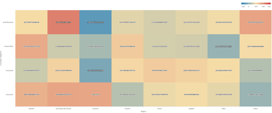
Using your organization's sales data, you want to show average profit across a large number of categories in two dimensions: region and customer segment. To do this, you create a heat map chart. The average profit value is sorted by color, from blue (low) to red (high):

Stepped Heat map chart
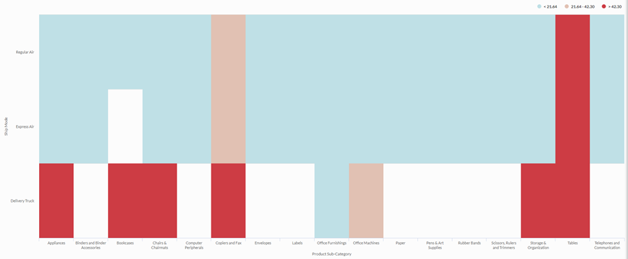
You need to examine the relationship between shipping method and product category for your organization. You are looking for a simple analysis that groups average shipping cost into three bins: low, medium, and high.
To visualize this relationship, you create a stepped heat map with three steps. Values are grouped into the corresponding bins based on the step thresholds:

Data configuration settings
On the Configure ![]() panel, click Data and configure the following settings:
panel, click Data and configure the following settings:
| Setting | Supported data types | Description |
|---|---|---|
| X-Axis |
|
The field to use as the category on the chart's horizontal scale. |
| Y-Axis |
|
The field to use as the category on the chart's vertical scale. |
| Color by |
numeric |
The field that determines the color of the box at the intersection of the X and Y axis values:
|
Chart display settings
On the Configure ![]() panel, click Display and configure the following settings:
panel, click Display and configure the following settings:
| Setting | Description |
|---|---|
| Options | |
| Show Legend | Show or hide the legend at the top of the chart. |
| Show Values | Show or hide the data point values. |
| X-Axis | |
| Show Label | Show or hide the label for the x-axis. |
| Y-Axis | |
| Show Label | Show or hide the label for the y-axis. |
| Other settings | |
| Color | The starting, middle, and ending values for the heatmap range. You can specify a color and numeric boundary for each place on the scale. |
| Stepped Colors | Display the categories as discrete buckets rather than a constant scale. You can specify between 2 and 20 steps. |