Area chart
Area charts compare historical trends or changes by showing the proportion of the total that each category represents at any given point in time. They communicate overall trends rather than individual values when comparing multiple data series.
When do you use it?
Use area charts to show how each category contributes to a cumulative total over time.
Few charts are as effective at representing time-series relationships as area charts. The area component of the chart represents the volume or proportion of the whole in the space between the axis and the data point.
Tip
A time series is a series of data points listed in time order, typically at equal intervals.
Available types of area charts
The following types of area charts are available:
- Standard shows a quantitative progression over time
- Stacked shows the proportion of the total that each category represents at any given point in time
- 100% Stacked shows how the constituent parts of a whole have changed over time
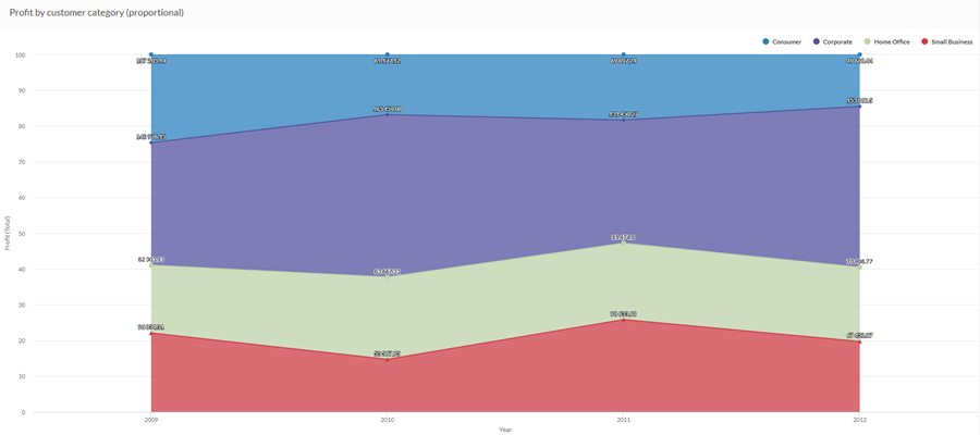
The y-axis expands to 100% and each colored area represents one part of the whole, with each part stacked vertically. The height of each colored stack represents the percentage proportion of that category at a given point in time.
Examples
Standard area chart
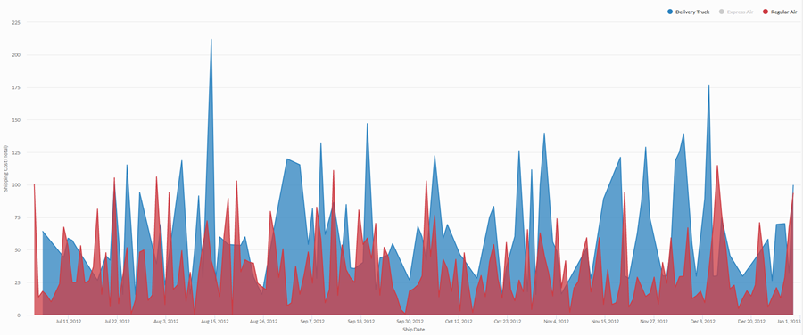
Using aggregated sales data from a four-year period, you need to communicate the trend in shipping costs for each shipping method your organization uses. To do this, you create a standard area chart that shows the trend in costs, broken down by shipping method, over the period:

Stacked area chart
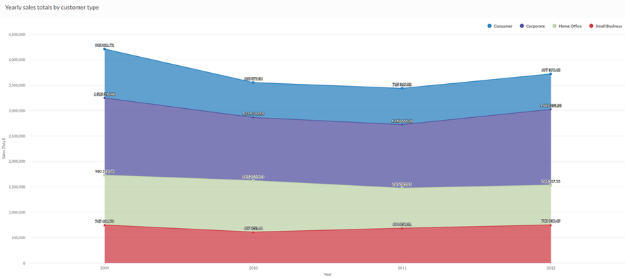
Using aggregated sales data from a four-year period, you need to communicate the proportional trend in overall sales, broken down by customer segments over time. To do this, you create a stacked area chart that show the trend over the period:

100% stacked area chart
Using aggregated sales data from a four-year period, you need to communicate how sales to different customer segments have changed over time. To do this, you create a 100% stacked area chart that shows how each segment has performed over time in relation to the total:

Data configuration settings
On the Configure ![]() panel, click Data and configure the following settings:
panel, click Data and configure the following settings:
| Setting | Supported data types | Description |
|---|---|---|
| X-Axis |
|
The field to use as the basis for the chart's horizontal scale. |
|
Y-Axis |
numeric |
The aggregate value represented by the chart's vertical axis. You can select a count of the x-axis field or one of several aggregate values for a different numeric column in the table:
The position of data points on the vertical scale determines the height of each line. The height of a line is interpolated or gapped if a data point is missing. |
|
Color by optional |
character |
The field represented by the third data dimension to the chart. Adding a third data dimension creates the categories represented by stacked areas. A separate stacked area is created for each unique value in the field. |
Chart display settings
On the Configure ![]() panel, click Display and configure the following settings:
panel, click Display and configure the following settings:
| Setting | Description |
|---|---|
| Options | |
| Show Legend | Show or hide the legend at the top of the chart. |
| Show Values | Show or hide the data point values. |
| Chart Type |
The type of area chart to use:
|
| Interpolate |
Handle missing data points by connecting the line using the available data points, but do not plot the missing data point on the x-axis. If disabled, the line is not connected across missing data points. |
| X-Axis | |
| Show Label | Show or hide the label for the x-axis. |
| Y-Axis | |
| Show Label | Show or hide the label for the y-axis. |
| Min | The minimum value to use for the y-axis. By default, the chart uses the lowest value of the y-axis data to determine the minimum. |
| Max | The maximum value to use for the y-axis. By default, the chart uses the highest value of the y-axis data to determine the minimum. |
| Other settings | |
| Colors | The colors assigned to each series in the Color by dimension. |