Treemap chart
Treemaps display hierarchical, tree-structured data as a set of nested rectangles. Each group is given a rectangle, which is then tiled with smaller rectangles representing sub-groups. Size and color are used to show separate numeric dimensions of the data.
When do you use it?
Use treemaps when working with large amounts of data that is hierarchically structured. When color and size are correlated, treemaps can help identify patterns that would otherwise be difficult to see.
Treemaps are also effective at legibly displaying large volumes of information in a single screen. Viewers can then drill into a specific category to explore further.
Note
Treemaps support up to two levels of grouping at this time.
Examples
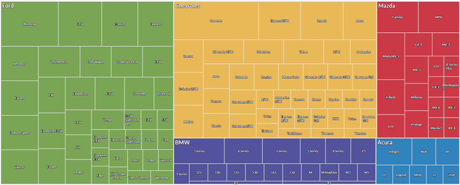
Car makes and models
You have a table that contains an inventory of cars. You want to visualize the count of car models within each make to get an overview of the inventory.
To visualize this data, you use a treemap and:
- group the data by make, and then by model
- set Size by to the count of vehicles
Based on the results, you can see how the inventory is distributed across makes and models:
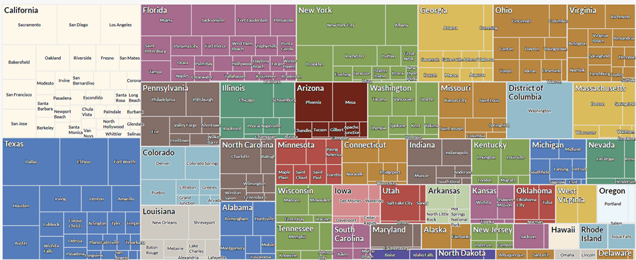
Transaction totals by state and city
You have a table that contains transactions across multiple states and cities in the United States of America. As part of your analysis, you want to visualize the total transaction amount by state and by city within each state.
To visualize this data, you use a treemap and:
- group the data by state, and then by city
- set Size by to the sum of transactions
Based on the results, you can see a pattern start to emerge for the aggregate transaction amount within these groups:
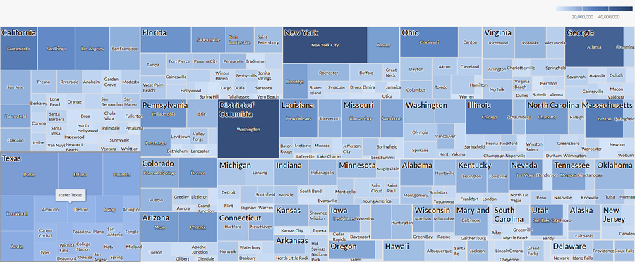
Transaction counts and totals by state and city
You have a table that contains transactions across multiple states and cities in the United States of America. As part of your analysis, you want to visualize the count of transactions and the total transaction amount by state and by city within each state.
To visualize this data, you use a treemap. You group the data by state, and then by city. You also use the following additional settings:
- Size by count
- Color by sum of transactions
Based on the results, you can determine how transactions are distributed across different city and state combinations, and see a pattern start to emerge for the aggregate transaction amount within these groups:
Data configuration settings
On the Configure ![]() panel, click Data and configure the following settings:
panel, click Data and configure the following settings:
| Setting | Supported data types | Description |
|---|---|---|
| Group |
|
The fields to use as categories. The second group you select is nested within the first group. Groups are displayed as rectangles. You can select a maximum of two groups. |
| Size by | numeric |
The aggregate value that determines the size of each group. You can select a count of records or one of several aggregate values for a numeric column in the table:
|
|
Color by optional |
numeric |
The aggregate value that determines the color intensity, or scale, of each group. You can select a count of records or one of several aggregate values for a numeric column in the table:
|
Chart display settings
On the Configure ![]() panel, click Display and configure the following settings:
panel, click Display and configure the following settings:
| Setting | Description |
|---|---|
| Options | |
| Show Legend | Show or hide the legend at the top of the chart. |
| Group Labels | |
| Show First Group | Include labels for values in the first group. |
| Show Second Group | Include labels for values in the second group. |
| Other settings | |
| Colors |
The colors assigned to:
|