Bubble chart
Bubble charts communicate the raw count, frequency, or proportion of a variable. Bubble size reflects quantity, bubble color reflects category, and the x and y axes both display independent values.
When do you use it?
Use bubble charts when you are working with three data series that each contain a set of values. You can add an optional fourth variable for categorization. The bubble size is effective for emphasizing specific values and comparisons between categories.
When designing bubble charts, use clear and visible labels as these charts require clear labeling to help interpret the visualization.
Examples
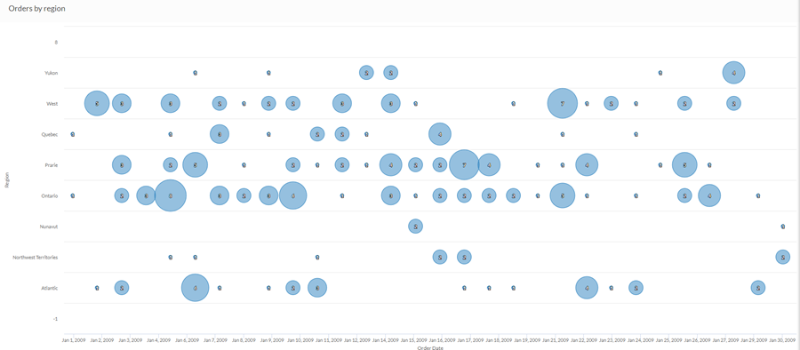
Three dimensional bubble chart
Using sales data from a single month, you want to identify the proportion of orders placed from each region over the period. Using a simple bubble chart, you plot the count of orders by region over the month:
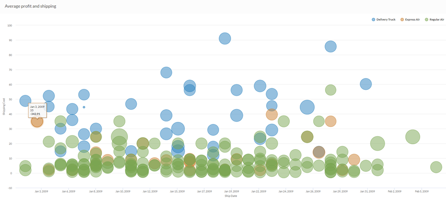
Four dimensional bubble chart
Using sales data from a single month, you want to identify any relationships between shipping and profit. Using a complex bubble chart, you plot the average profit as it relates to shipping cost and shipping method over the month:
Data configuration settings
On the Configure![]() panel, click Data and configure the following settings:
panel, click Data and configure the following settings:
| Setting | Supported data types | Description |
|---|---|---|
| X-Axis |
|
The field to use as the basis for the chart's horizontal scale. |
|
Y-Axis |
|
The field to use as the basis for the chart's vertical scale. |
|
Bubble size |
numeric |
The numeric field to use to determine the size of individual data points. An increase in size indicates an increase in quantity or value. You can select a count of the x-axis field or one of several aggregate values for a different numeric column in the table:
Tip You can control decimals and rounding on numeric data by changing the format of this field in the table view. For help doing this, see Data formatting options. |
|
Color by optional |
character |
The field represented by the fourth data dimension to the chart. Adding a fourth data dimension identifies the data points by category. You can think of the Color by field as a break field. |
|
Format options |
numeric |
Select an option in this field to apply formatting such as decimals and rounding to the Y-axis values in the chart. For help doing this, see Data formatting options. Format options is available only for the Average aggregate option. For all other aggregate options, format options set in Table View is applied. |
Chart display settings
On the Configure![]() panel, click Display and configure the following settings:
panel, click Display and configure the following settings:
| Setting | Description |
|---|---|
| Options | |
| Show Legend | Show or hide the legend at the top of the chart. |
| Show Values | Show or hide the data point values. |
| X-Axis | |
| Show Label | Show or hide the label for the x-axis. |
| Y-Axis | |
| Show Label | Show or hide the label for the left y-axis. |
| Min | The minimum value to use for the left y-axis. By default, the chart uses the lowest value of the left y-axis data to determine the minimum. |
| Max | The maximum value to use for the left y-axis. By default, the chart uses the highest value of the left y-axis data to determine the minimum. |
| Other settings | |
| Colors | The colors assigned to each series in the Color by dimension. |