Data visualization best practices
Data visualizations are essential to helping people understand the story within the data. Placing the data in a visual context helps patterns, trends, and correlations emerge that might otherwise go unnoticed. To make sure your data visualizations tell compelling stories, follow these best practices.
Know your audience
Before you start designing a data visualization, consider who the primary audience is for the visual representation of the data.
Make sure the visualization answers the questions that are most important to the primary audience. Resist the temptation to create visualizations that meet the needs of any and all potential audiences as this may make the message for your intended audience less clear.
To design for your audience, ask yourself these key questions:
- who is my primary audience?
- how will my audience view this visualization?
- what actions do I want the audience to take based on this data?
Provide context
Data trends and patterns are best demonstrated in the context of larger goals and metrics. By presenting your data visualizations within context, a better story emerges from your data and stakeholders can draw clearer conclusions:
- use color to imply meaning
- compare data to metrics or goals
- ensure data periods are clearly indicated
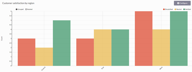
Example: associating colors with meaning
You need to provide a visualization for customer satisfaction ratings by regional division in your company. To visualize this data, you choose a grouped bar chart and then use color to associate the satisfaction ratings with meaning:
- Satisfied green
- Neutral yellow
- Dissatisfied red
This color to word association makes it easy for your audience to understand the overall meaning of the data without having to study the details closely.
Keep it simple and clear
Your audience has a short attention span. If your visualization cannot be clearly understood within 10 to 15 seconds, your audience may miss the point. Use the following tips to simplify your visualizations and improve clarity:
- use white space to make labels and chart components distinct
- write descriptive labels and headings so that nothing is ambiguous
- align chart colors with the meaning you are trying to convey
- keep text short and simple so it is easy to read
- tell one story at a time to avoid confusing your audience
Understand your data
There are three types of data you may encounter when building visualizations:
- categorical data that belongs together logically but has no intrinsic ordering (department: sales, human resources, IT, etc.)
- ordinal data that belongs together logically and has an intrinsic ordering (education: high school, some college, college graduate, etc.)
- quantitative data that defines a quantity, or how much, of something there is (transaction amount: $400, $100, $175, etc.)
What kind of data are you trying to visualize? Knowing the data you are working with makes choosing the right chart type and communicating meaning an easier proposition.
Choose the right chart type
Once you understand your audience and your data, it is time to select the chart type that best expresses the story in the data:
| Chart type | Description | Suitable data type(s) |
|---|---|---|
|
|
Compares quantities of categorical data | Categorical, Quantitative |
|
|
Shows change over time | Ordinal, Quantitative |
|
|
Shows how categories contribute to a cumulative total over time | Ordinal, Categorical, Quantitative |
|
|
Shows the parts of a whole | Categorical |
|
|
Shows correlations between three or four variables Tip If no correlation exists, the points appear randomly scattered. If a strong correlation exists, the points concentrate near a straight line. |
Quantitative, Ordinal, Categorical |
|
|
Compares variables across a large number of categories and sort data by color intensity | Categorical, Quantitative |
Next steps... create a chart
For information about creating any of the charts available to you, see Visualizing table data in charts.