Bar chart
A bar chart is a graph with rectangular bars. Each bar's length is proportional to the value it represents. Use bar charts to compare two or three variables using a single value.
When do you use it?
Basic bar charts
Bar charts are useful for comparing categories: the x-axis represents the category and the y-axis represents the value to compare.
Tip
You can also use a basic bar chart to create a histogram that displays the distribution of x-axis data. Histograms display the frequency of each unique value in the selected x-axis field as a bar that is proportional to the value.
Complex bar charts
Bar charts can represent more complex categories using grouped or stacked bars. Grouped or stacked bar charts use a third variable to sub-divide the comparison category:
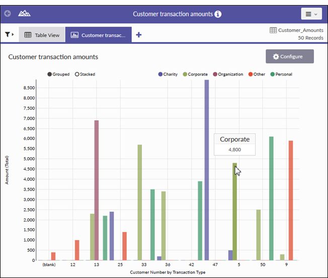
- grouped third dimension values are displayed as adjacent bars within the second dimension value
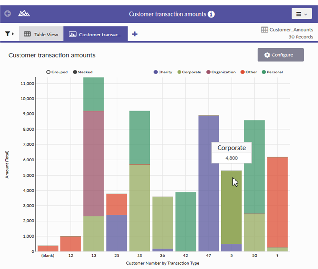
- stacked a single second dimension bar is divided by the third dimension values
Note
Select the grouped vs stacked view setting on the upper left-hand corner of the chart.
Data configuration settings
Examples
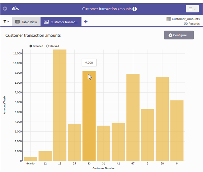
Bar chart with two data dimensions (Customer
Number and Amount)
Grouped bar chart with three data dimensions
(Customer Number, Amount, and Transaction Type)
Stacked bar chart with three data dimensions
(Customer Number, Amount, and Transaction Type)