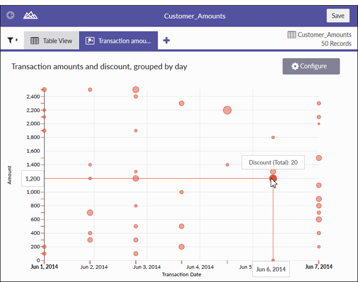
Bubble chart with three data dimensions (Transaction Date, Amount, and Discount)
Bubble chart with four data dimensions (Transaction Date, Amount, Discount, and Customer Number)
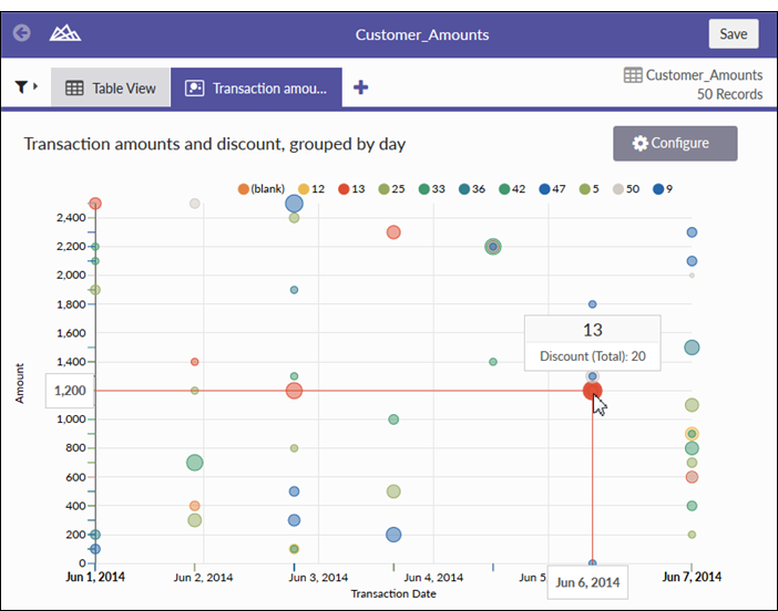
Bubble charts communicate the raw count, frequency, or proportion of a variable. Bubble size reflects quantity, bubble color reflects category, and the x and y axes both display independent values.
Use bubble charts when you are working with three data series that each contain a set of values. You can add an optional fourth variable for categorization. The bubble size is effective for emphasizing specific values and comparisons between categories.
When designing bubble charts, use clear and visible labels as these charts require clear labeling to help interpret the visualization.
| Setting | Supported data types | Description |
|---|---|---|
| X-Axis |
|
The field to use as the basis for the chart’s horizontal scale. Typically, a date or text field is used as the basis for the X-axis. |
|
Y-Axis |
|
The aggregate value represented by the chart’s vertical axis. You can select a count of the X-axis field or one of several aggregate values for a different numeric column in the table:
|
|
Bubble size |
numeric |
The numeric field to use to determine the size of individual data points. An increase in size indicates an increase in quantity or value. You can select a count of the X-axis field or one of several aggregate values for a different numeric column in the table:
|
|
Color by (optional setting) |
character |
The field represented by the fourth data dimension to the chart. Adding a fourth data dimension identifies the data points by category. You can think of the Color by field as a break field. |