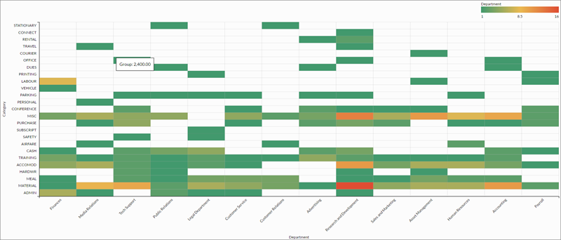
A heat map is a graphical representation of data where the individual values contained in a matrix are represented as colors. Data points are defined by an x and y axis intersection and a third value that determines the data point's color.
Use heat maps to compare variables across a large number of categories and to sort complex data by color intensity.
Data values appear as boxes on the heat map. The size and color of each box are determined by the data for that item:
The lowest values are colored green, the mid-range values are colored yellow, and the highest values are colored red. Data points are colored using one of the following display setting coloring schemes:
| Setting | Supported data types | Description |
|---|---|---|
| X-Axis | character | The field to use as the category on the chart’s horizontal scale. |
| Y-Axis | character | The field to use as the category on the chart’s vertical scale. |
| Color by |
numeric |
The field that determines the color of the box at the intersection of the X and Y axis values:
|