Pie chart with two data dimensions (Customer Number and Amount)
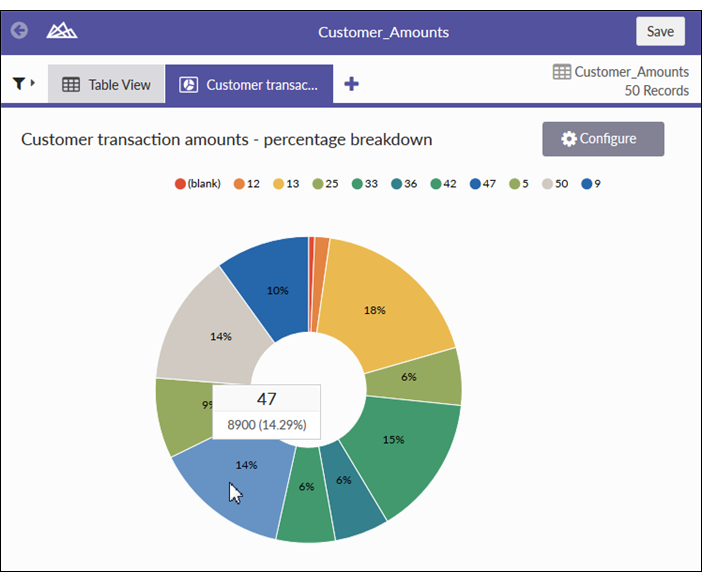
Pie charts show categories as a proportion or a percentage of the whole. Use pie charts to show the composition of categorical data with each segment proportional to the quantity it represents.
Pie charts are effective when comparing parts of a whole for a static period. They do not show change over time.
Consider using a pie chart if you are working with:
| Setting | Supported data types | Description |
|---|---|---|
| Categories display | character | The field represented by pie chart sections. One section is created for each unique value in the field. |
| Value | numeric | The aggregate value that serves as the basis for the chart’s values. The total of all values in the field for each category determines the size of the pie chart sections. |