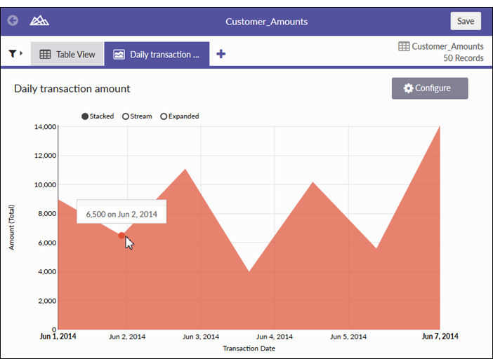
Stacked area chart with two data dimensions (Transaction Date and Amount)
Stacked area chart with three data dimensions (Transaction Date, Amount, and Customer Number)
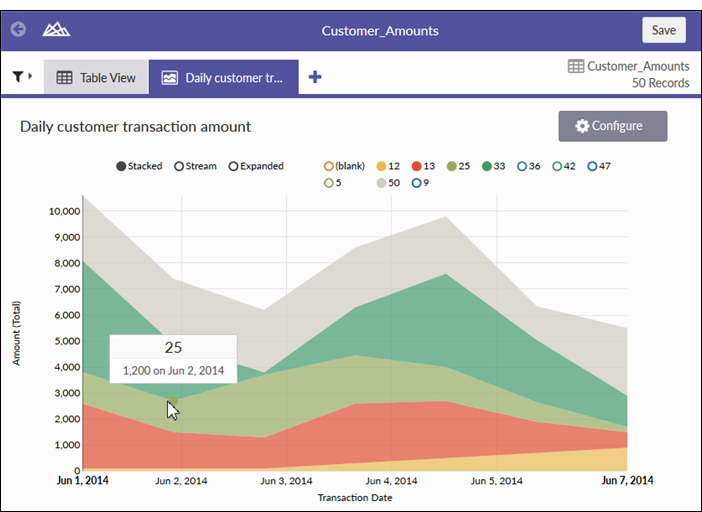
Stacked area charts compare historical trends or changes by showing the proportion of the total that each category represents at any given point in time. They communicate overall trends rather than individual values when comparing multiple data series.
Use stacked area charts to show how each category contributes to a cumulative total over time.
Few charts are as effective at representing time-series relationships as stacked area charts. The area component of the chart represents the volume or proportion of the whole in the space between the axis and the data point.
Tip
A time series is a series of data points listed in time order, typically at equal intervals.
On the upper left-hand corner of the chart, you can change the stacked area chart view options:
This option is primarily used for visualizing continuous data.
The y-axis expands to 100% and each colored area represents one part of the whole, with each part stacked vertically. The height of each colored stack represents the percentage proportion of that category at a given point in time.
| Setting | Supported data types | Description |
|---|---|---|
| X-Axis |
|
The field to use as the basis for the chart’s horizontal scale. Typically, a date field is used as the basis for the X-axis. |
|
Y-Axis |
numeric |
The aggregate value represented by the chart’s vertical axis. You can select a count of the X-axis field or one of several aggregate values for a different numeric column in the table:
|
|
Color by (optional setting) |
character |
The field represented by the third data dimension to the chart. Adding a third data dimension creates the categories represented by stacked areas. A separate stacked area is created for each unique value in the field. |