Concept Information
The Analytics Dialog Builder allows you to create one or more custom dialog boxes to gather user input during execution of a script.
You can use a custom dialog box to perform various functions:
- prompt a user for input, such as a table name, a field name, or a date range
- allow a user to select from among several options
- display more information than a standard message box
- dynamically list Analytics project items
Note
Using a custom dialog box to enter passwords is not secure. You should use the PASSWORD command instead.
Dialog box controls
In the Dialog Builder, you design and build a custom dialog box by adding user input controls to the dialog box.
Controls are small, interactive software components that provide different ways of gathering user input required by a script. You add one or more controls to the basic dialog box and configure them to suit your needs.
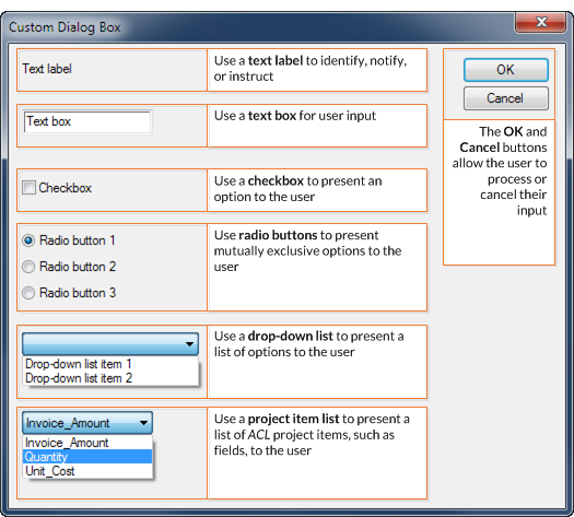
The following controls are available:
- text label
- text box
- checkbox
- radio button
- drop-down list
- project item list
The sample custom dialog box below provides an example of each type of control.
Dialog box automatically translated to a command
When you save a newly created custom dialog box, Analytics automatically translates the visual dialog box to a matching ACLScript DIALOG command.
The command is inserted at the line in the script where the cursor is positioned. When you run the script, the visual dialog box appears.
The example below shows a simple custom dialog box with one text label and one drop-down list, and the corresponding DIALOG command.
Custom dialog box
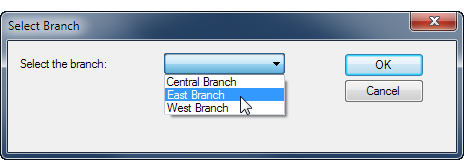
Corresponding DIALOG command
DIALOG (DIALOG TITLE "Select Branch" WIDTH 464 HEIGHT 116 ) (BUTTONSET TITLE "&OK;&Cancel" AT 336 12 DEFAULT 1 ) (TEXT TITLE "Select the branch:" AT 12 16 ) (DROPDOWN TITLE "Central Branch;East Branch;West Branch" TO "DROPDOWN1" AT 156 12 )
Create a custom dialog box – general steps
- Open the Analytics script that you want to add the custom dialog box to.
- Position the cursor in the line in the script where you want
to insert the DIALOG command.
Note
Position the cursor in a blank line. Create a new blank line if necessary.
- Click Build New Dialog
 .
.Analytics displays the Dialog Builder with a default title of "User Dialog".
- Complete any of the following steps to create the custom
dialog box:
- Double-click the Dialog Builder to modify
the title or the size of the dialog box.
You specify the Width and Height of the dialog box in pixels. You can also resize the dialog box by dragging the bottom right corner of the working area in the Dialog Builder (Snap to Grid must be on).
- Click Snap to Grid
 to turn the grid
on or off in the Dialog Builder.
to turn the grid
on or off in the Dialog Builder.Use the grid to align controls in the layout area. When the grid is turned on, the top-left corner of each control is aligned with the closest grid point.
- On the left side of the Dialog Builder, click a control icon and then click in the layout
area to add the control.
Note
The steps for adding and designing specific controls appear below.
- Double-click the Dialog Builder to modify
the title or the size of the dialog box.
- Add as many controls as you need.
- If you need to modify a control once you have add it, double-click the control.
- If you need to delete a control from the Dialog Builder, select the control and click Delete
 .
.Note
You cannot delete the OK and Cancel buttons, but you can rename them (see below).
- Click Close to exit the Dialog Builder.
- Click OK in the confirmation dialog
box to save your changes.
Analytics displays the corresponding DIALOG command in the Script Editor. You can see all the controls in the custom dialog box by scrolling to the right.
-
Optional. In the DIALOG command in the script, edit the label text for the OK or the Cancel buttons.
Typically you should not edit the OK and Cancel labels. If you do edit the labels, ensure that the positive value (for example, Yes) comes before the negative value (for example, No).
Edit only the label text. For example: "&Yes;&No"
Modify a custom dialog box
If you need to modify a custom dialog box after you have created it, position the cursor in the corresponding DIALOG command and click Edit Command  .
.
Add a text label
Use the text control to add a text label to the custom dialog box.
A text label can be used for any of the following purposes:
- to identify another control
- to provide a notification
- to prompt or instruct users
- to provide any other text-based information required in the custom dialog box
Text labels are display-only and are not associated with any interactive functionality.
Steps
 Show me how
- In the Dialog Builder,
click Text
 and
then click the layout area at the position where you want the top left
corner of the control.
and
then click the layout area at the position where you want the top left
corner of the control.The Text dialog box opens.
- In the Label field, type the text
that you want to display in the custom dialog box.
You are limited to a maximum of 255 characters, including spaces.
- Optional. If you want to specify the exact position of the control, modify the x (horizontal) and y (vertical) values, which are specified in pixels.
Tip
You can also position the control by dragging it in the Dialog Builder.
- Optional. If you want to specify a specific size for the control, deselect
Auto beside the Width or Height fields and modify the values, which are specified in pixels.
- Auto selected the text control automatically adjusts to the size of the text contained by the control
- Auto deselected the text control remains at the specified size, regardless of the size of the text contained by the control
Tip
You can also resize the control using the resize handles in the Dialog Builder.
- Under Alignment, specify the alignment of the text in the control by selecting Left, Right, or Center.
- Click OK to add the control to the Dialog Builder.
Add a text box
Use the edit box control to add a text box to the custom dialog box.
A text box gathers information that the user must type in, such as dates, or vendor or customer IDs.
Edit box variable
The edit box control creates a character variable for storing the user input.
Steps
Show me how
- In the Dialog Builder,
click Edit Box
 and
then click the layout area at the position where you want the top left
corner of the control.
and
then click the layout area at the position where you want the top left
corner of the control.The Editbox dialog box opens.
- Optional. In the Variable field, type the name of the variable that will store the value
input by the user in the custom dialog box.
You can choose to keep the default variable name of EDITn.
- Optional. In the Default Text field, specify a default input value for the text box.
If the user does not specify an input value, the default value is used.
- Optional. If you want to specify the exact position of the control, modify the x (horizontal) and y (vertical) values, which are specified in pixels.
Tip
You can also position the control by dragging it in the Dialog Builder.
- Optional. If you want to specify a specific size for the control, deselect
Auto beside the Width or Height fields and modify the values, which are specified in pixels.
- Auto selected the edit box control automatically adjusts to the size of the text contained by the control
- Auto deselected the edit box control remains at the specified size, regardless of the size of the text contained by the control
Tip
You can also resize the control using the resize handles in the Dialog Builder.
- Click OK to add the control to the Dialog Builder.
Add a checkbox
Use the checkbox control to add a checkbox to the custom dialog box.
A checkbox presents a binary choice to the user — that is, the associated option can be either on or off. For example, you could use a checkbox to allow a user to either include or exclude the Email Address field in a data extract from a personnel table.
Combinations of options
Use multiple checkboxes to allow a user to select any combination of options in a custom dialog box. If options are mutually exclusive, use radio buttons instead.
Checkbox variable
The checkbox control creates a logical variable for storing the user input. The variable stores a value of True if the checkbox is selected, and False if the checkbox is unselected.
Steps
Show me how
- In the Dialog Builder,
click Check Box
 and
then click the layout area at the position where you want the top left
corner of the control.
and
then click the layout area at the position where you want the top left
corner of the control.The Checkbox dialog box opens.
- Optional. In the Variable field, type the name of the variable that will store the value
input by the user in the custom dialog box.
You can choose to keep the default variable name of CHECKBOXn.
- In the Label field, type the text
that you want to accompany the checkbox.
You are limited to a maximum of 255 characters, including spaces.
- Optional. If you want to specify the exact position of the control, modify the x (horizontal) and y (vertical) values, which are specified in pixels.
Tip
You can also position the control by dragging it in the Dialog Builder.
- Optional. If you want to specify a specific size for the control, deselect
Auto beside the Width or Height fields and modify the values, which are specified in pixels.
- Auto selected the checkbox control automatically adjusts to the size of the text contained by the control
- Auto deselected the checkbox control remains at the specified size, regardless of the size of the text contained by the control
Tip
You can also resize the control using the resize handles in the Dialog Builder.
- Under Initial State, specify whether the checkbox is Unchecked or Checked when the custom dialog box first opens.
- Click OK to add the control to the Dialog Builder.
Add radio buttons
Use the radio button control to add two or more radio buttons to the custom dialog box.
Radio buttons present mutually exclusive options to the user — that is, only one of the presented options can be selected at a time. For example, you could use two radio buttons to allow a user to select either:
- amounts less than $5000
- amounts greater than or equal to $5000
Mutually exclusive options
Use multiple radio buttons to allow a user to select only one from a number of options in a custom dialog box. If the options are not mutually exclusive, use checkboxes instead.
Radio button variable
The radio button control creates a numeric variable for storing the user input. The variable stores a value of 1 if the first radio button is selected, 2 if the second radio button is selected, and so on.
Steps
Show me how
- In the Dialog Builder,
click Radio Button
 and
then click the layout area at the position where you want the top left
corner of the control.
and
then click the layout area at the position where you want the top left
corner of the control.The Radiobuttons dialog box opens.
- Optional. In the Variable field, type the name of the variable that will store the value
input by the user in the custom dialog box.
You can choose to keep the default variable name of RADIOn.
- In the Label field, type the text
that you want to accompany the first radio button and click Add.
You are limited to a maximum of 255 characters, including spaces.
The radio button is added to the Label List.
- Add additional labels for each additional radio button that you want.
Each additional radio button is added to the end of the Label List.
Note
Because the radio button control creates mutually exclusive options, you should have at least two radio buttons.
- Optional. Instead of adding a radio button to the end of the Label List, you can use any of these other options:
Option Description Insert Allows you to insert a radio button anywhere in the Label List.
Before you click Insert, select the list item immediately below where you want to insert the new radio button.
Replace
(Rename)
Allows you to replace a radio button in the Label List. Replace essentially renames the radio button.
Before you click Replace, select the list item that you want to replace with the new radio button.
Delete Allows you to delete a radio button from the Label List.
Select the list item that you want to delete and click Delete.
Set Default Allows you to specify which radio button is selected by default when the custom dialog box first opens.
Select the list item that you want to specify as the default and click Set Default.
- Optional. If you want to specify the exact position of the control, modify the x (horizontal) and y (vertical) values, which are specified in pixels.
Tip
You can also position the control by dragging it in the Dialog Builder.
- Optional. If you want to specify a specific size for the control, deselect
Auto beside the Width or Height fields and modify the values, which are specified in pixels.
- Auto selected the radio button control automatically adjusts to the size of the text contained by the control
- Auto deselected the radio button control remains at the specified size, regardless of the size of the text contained by the control
Tip
You can also resize the control using the resize handles in the Dialog Builder.
- Under Alignment, specify whether the radio buttons have a Horizontal or Vertical alignment in the custom dialog box.
- Click OK to add the control to the Dialog Builder.
Add a drop-down list
Use the drop-down list control to add a drop-down list to the custom dialog box.
A drop-down list presents a list of custom, text-based options to the user. The user can select only one of the options at a time. For example, you could use a drop-down list to allow a user to select:
- a month of the year
- a category
- a company department or branch
Mutually exclusive options
The options in a drop-down list are mutually exclusive. You could use radio buttons to achieve a similar result, but for lists of more than a few items, drop-down lists are more compact and easier to use.
If you want to allow a user to select more than one option at a time, use checkboxes instead.
Drop-down list variable
The drop-down list control creates a character variable for storing the user input.
Steps
Show me how
- In the Dialog Builder,
click Drop-down List
 and
then click the layout area at the position where you want the top left
corner of the control.
and
then click the layout area at the position where you want the top left
corner of the control.The Dropdown list dialog box opens.
- Optional. In the Variable field, type the name of the variable that will store the value
input by the user in the custom dialog box.
You can choose to keep the default variable name of DROPDOWNn.
- In the Label field, type the text
that you want to accompany the first drop-down list item and click Add.
You are limited to a maximum of 255 characters, including spaces.
The list item is added to the Label List.
- Add additional labels for each additional list item that you want.
Each additional list item is added to the end of the Label List.
Note
Because the drop-down list control creates mutually exclusive options, you should have at least two list items.
- Optional. Instead of adding a list item to the end of the Label List, you can use any of these other options:
Option Description Insert Allows you to insert a list item anywhere in the Label List.
Before you click Insert, select the list item immediately below where you want to insert the new item.
Replace
(Rename)
Allows you to replace a list item in the Label List. Replace essentially renames the list item.
Before you click Replace, select the list item that you want to replace with the new item.
Delete Allows you to delete a list item from the Label List.
Select the list item that you want to delete and click Delete.
Set Default Allows you to specify which list item is selected by default when the custom dialog box first opens.
Select the list item that you want to specify as the default and click Set Default.
- Optional. If you want to specify the exact position of the control, modify the x (horizontal) and y (vertical) values, which are specified in pixels.
Tip
You can also position the control by dragging it in the Dialog Builder.
- Optional. If you want to specify a specific size for the control, deselect
Auto beside the Width or Height fields and modify the values, which are specified in pixels.
- Auto selected the drop-down list control automatically adjusts to the size of the text contained by the control
- Auto deselected the drop-down list control remains at the specified size, regardless of the size of the text contained by the control
Tip
You can also resize the control using the resize handles in the Dialog Builder.
- Click OK to add the control to the Dialog Builder.
Add a project item list
Use the project item list control to add a project item list to the custom dialog box.
A project item list presents a list of Analytics project items, such as tables or fields, to the user. The list of items is dynamically populated based on the contents of the Analytics project in which the script is run.
The user can select only one of the options at a time. For example, you could use a project item list to allow a user to select:
- a table for a particular month, from all the tables for the year
- a particular numeric field, from all the numeric fields in a table
- a particular subscript, from among several possible subscripts
Categories of project items
When you create a project item list you do not specify actual project items, you specify a category of project item. For example, you specify the Character Fields category if you want to present the user with a list of all character fields in the open table when the script runs.
Based on the category or categories you specify, Analytics dynamically populates the project item list in the custom dialog box.
Available categories
The following categories are available:
|
|
|
Project item list variable
The project item list control creates a character variable for storing the user input.
Steps
Show me how
- In the Dialog Builder,
click Project Item List
 and
then click the layout area at the position where you want the top left
corner of the control.
and
then click the layout area at the position where you want the top left
corner of the control.The Project item list dialog box opens.
- Optional. In the Variable field, type the name of the variable that will store the value
input by the user in the custom dialog box.
You can choose to keep the default variable name of ITEMn.
- In the Category drop-down list, select the category of project item that you want in the project item list and click Add.
For example, if you select Numeric Fields, the project item list contains all numeric fields in the open table when the script is run.
The category is added to the Category List.
- Optional. Add additional categories that you want.
Each additional category is added to the end of the Category List.
Caution
Adding dissimilar categories, such as tables and fields, or scripts and variables, is potentially confusing for users. A best practice is to add only similar categories, such as character fields and numeric fields.
- Optional. Instead of adding a category to the end of the Category List, you can use any of these other options:
Option Description Insert Allows you to insert a category anywhere in the Category List.
Before you click Insert, select the category immediately below where you want to insert the new category.
Replace
Allows you to replace a category in the Category List.
Before you click Replace, select the category that you want to replace with the new category.
Delete Allows you to delete a category from the Category List.
Select the category that you want to delete and click Delete.
- Optional. In the Default field, specify a project item that is selected by default when the custom dialog box first opens.
For example, you could specify a particular table name, or field name.
Note
Do not specify a Category name.
Make sure you exactly replicate the spelling of the project item, including any underscores (_).
- Optional. If you want to specify the exact position of the control, modify the x (horizontal) and y (vertical) values, which are specified in pixels.
Tip
You can also position the control by dragging it in the Dialog Builder.
- Optional. If you want to specify a specific size for the control, deselect
Auto beside the Width or Height fields and modify the values, which are specified in pixels.
- Auto selected the project item list control automatically adjusts to the size of the text contained by the control
- Auto deselected the project item list control remains at the specified size, regardless of the size of the text contained by the control
Tip
You can also resize the control using the resize handles in the Dialog Builder.
- Click OK to add the control to the Dialog Builder.