The Industry tab
You can use the Industry tab in the News & Analytics iOS hub to view industry health assessments based on a measure of positive and negative news coverage.
Note
The News & Analytics iOS hub may not be available for your industry or site yet. Contact your Customer Success Manager for more information.
-
Tap News & Analytics in the left-hand navigation panel.
Note
If the left-hand navigation panel is not visible, tap the Navigation menu icon in the upper left-hand corner to expand it.
-
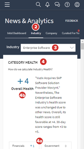
To view aggregated new stories and analysis for your industry, tap the Industry tab.
-
To view information and analytics about a different industry, tap the dropdown at the top of the page, and then select an industry type from the dropdown.
-
In the Category Health section, each category health score is based on the number of positive, negative, and neutral storylines identified for each category as related to your industry.
-
To filter the storylines section by a category, tap a category tile.
-
The Overall Health score is the combined assessment of all these categories and news stories.
Note
In calculating the Overall Health and Category scores, a positive storyline is worth +1 (plus one), a negative storyline is worth –1 (minus one), and a neutral storyline neither adds nor subtracts from the total score. For more information on storylines, see below.
-
-
In the Storylines section, the Industry Health Timeline chart is a visual representation of the positive, negative, and neutral storylines that have been identified in the media over the time period visible on the chart.
Note
What is a storyline? A storyline is a collection of similar stories related to a topic identified in the media coverage of your industry. A storyline comprises one or more stories over a period of time, and is assessed, using a proprietary algorithm, to be positive, negative, or neutral.
-
To display the Industry Health Timeline chart, tap Show. The Show button updates to state Hide after you display the chart.
Note
If you are using a phone, you may need to rotate the phone to see the Show button.
-
Each storyline is represented with a colored line which extends from the date of the first article comprising that storyline to the last. Positive storylines are blue, neutral storylines are gray, and negative storylines are red.
-
-
To view the full list of the articles that a storyline contains, tap a storyline.
-
Each storyline in the list displays a blue, gray, or red bar along its left side to represent whether it is a positive, neutral, or negative storyline.
-
Each storyline also displays its category, the number of articles that have been identified about that story, and the start and end dates between which coverage of that story was identified.
-
-
To open an article from the selected story in your web browser, tap an article, and tap OK.
-
To view the storylines that were active on a specific day, tap the date location on the chart.
-
To view all the storylines on the chart, tap Clear Filters.
-
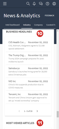
The Business Headlines section contains the major business news stories of the moment. To open the corresponding article in your web browser, tap a headline, and tap OK.
-
The Most Viewed Articles section contains a list of popular news articles for your industry. A collection of most the viewed articles will be available.