Vulnerability charts in Asset Manager
The Asset Manager app displays multiple charts that present vulnerability status, distribution, and trends. These charts provide a comprehensive view to support critical and strategic decision-making.
Important
Tenable VM integration with Asset Manager is available through the Early Adopter Program. If you want to opt in, contact your Diligent representative.
View vulnerability charts
-
From the Platform home page (www.diligentoneplatform.com), select the Asset Manager app to open it.
If you are already in Diligent One, you can use the left-hand navigation menu to switch to the Asset Manager app.
Note
Diligent One Platform also supports the domain www.highbond.com. For more information, see Supported domains.
- On the left hand side, select the expand button to open the side panel.
- Select Vulnerabilities > Charts Overview.
Result The vulnerability charts are displayed.
Which charts are available?
The following charts are available on the Charts Overview page.
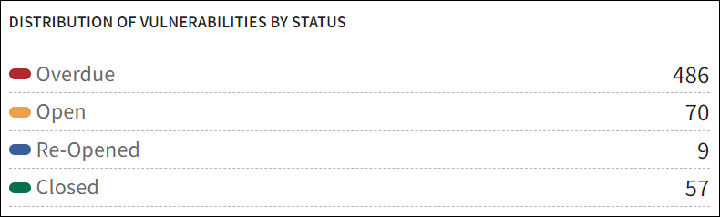
Distribution of Vulnerabilities by Status
This chart shows the current count of all identified vulnerabilities, categorizing them into statuses such as Overdue, Open, Re-Opened, and Closed. It provides a snapshot of how vulnerabilities are being managed and their resolution progress.
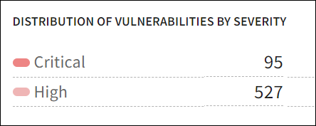
Distribution of Vulnerabilities by Severity
This chart shows the count of vulnerabilities based on their severity levels such as Critical and High. It helps in understanding the risk profile of the vulnerabilities, allowing prioritization based on severity.
Distribution of Overdue Vulnerabilities by Severity
This chart shows the count of vulnerabilities that have surpassed their due dates, based on the severity level of Critical and High. It highlights which critical issues have not been resolved within the expected timeframe, emphasizing areas that require immediate attention.
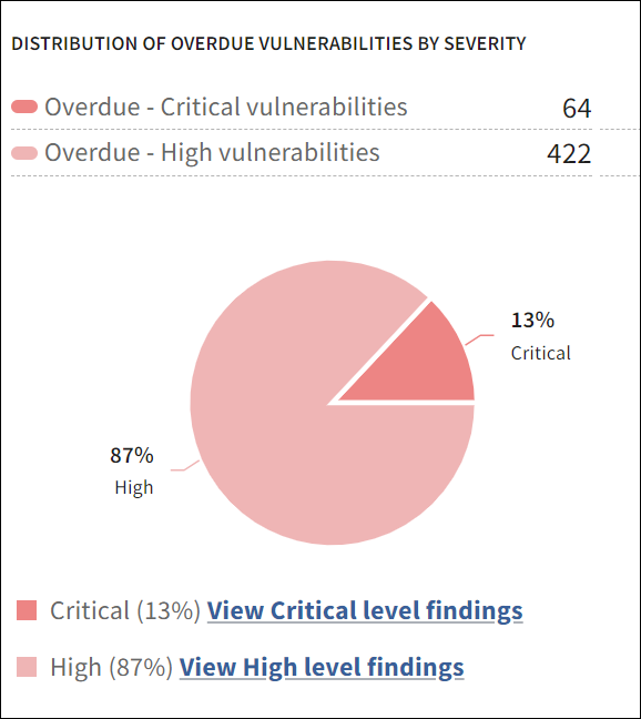
Click View Critical level findings at the bottom of the chart to be redirected to the Findings tab, which lists all findings with Critical severity. Similarly, you can click the other view link to access its respective list.
Vulnerability Status: 12-Month Trend
This trend chart tracks the changes in vulnerability statuses over the past 12 months. It provides insights into how effectively vulnerabilities are being addressed over time and helps in identifying any patterns or improvements in vulnerability management practices.
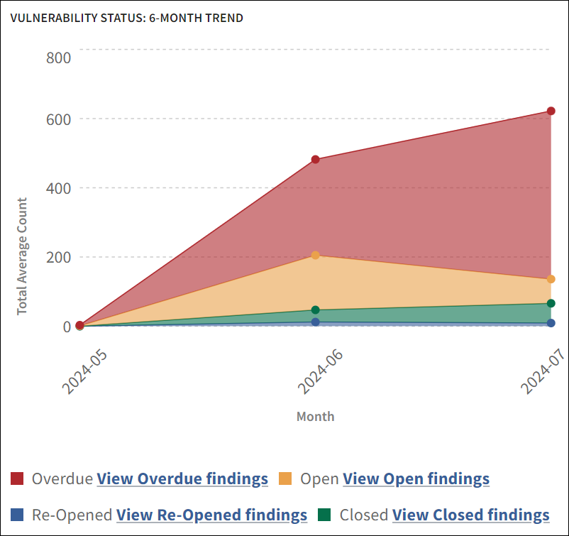
Click View Overdue findings at the bottom of the chart to be redirected to the Findings tab, which lists all findings with an Overdue status. Similarly, you can click the rest of the view links to access their respective lists.
Vulnerability Severity: 12-Month Trend
This trend chart illustrates the changes in the severity of vulnerabilities over the past 12 months. It helps in assessing the overall risk landscape and understanding how the severity of detected vulnerabilities has evolved, aiding in long-term security planning.
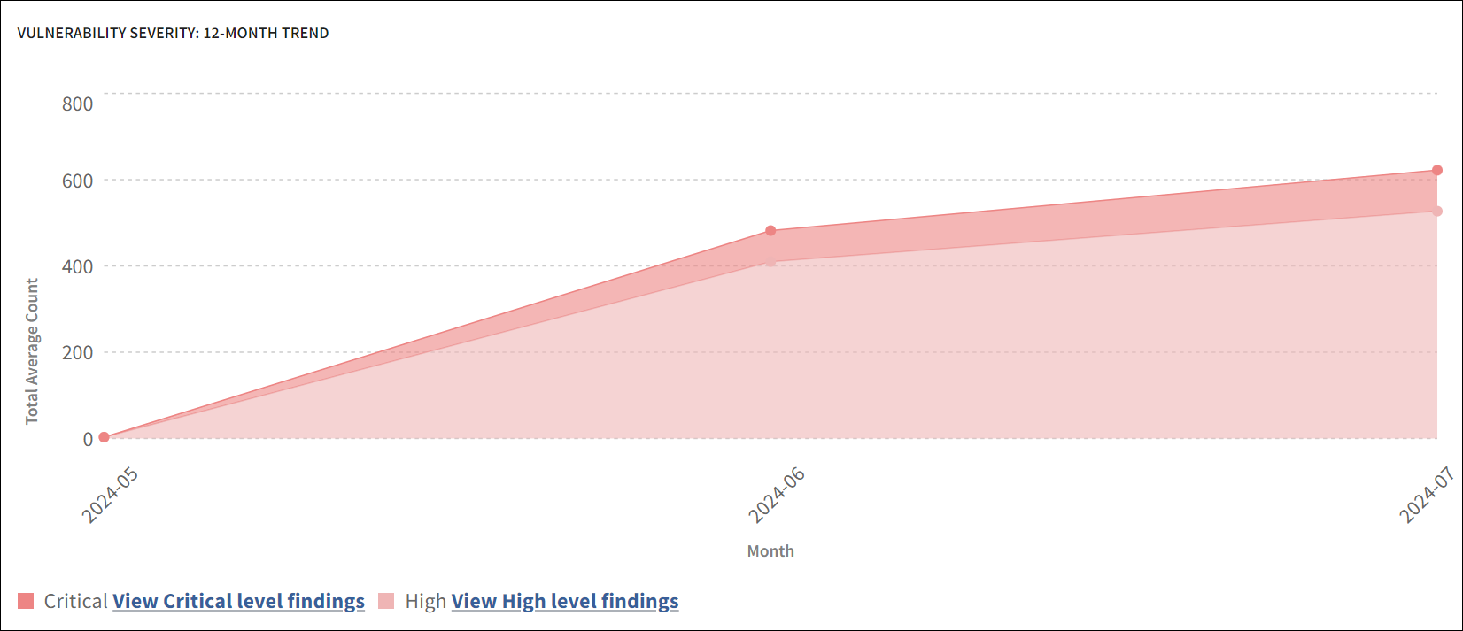
Click View Critical level findings at the bottom of the chart to be redirected to the Findings tab, which lists all findings with Critical severity. Similarly, you can click the other view link to access its respective list.
Open vs Closed Vulnerabilities: 12-Month Trend
This chart compares the number of open and closed vulnerabilities over the past 12 months. It provides a clear picture of the organization's ability to close vulnerabilities over time, indicating the efficiency of the vulnerability management process.
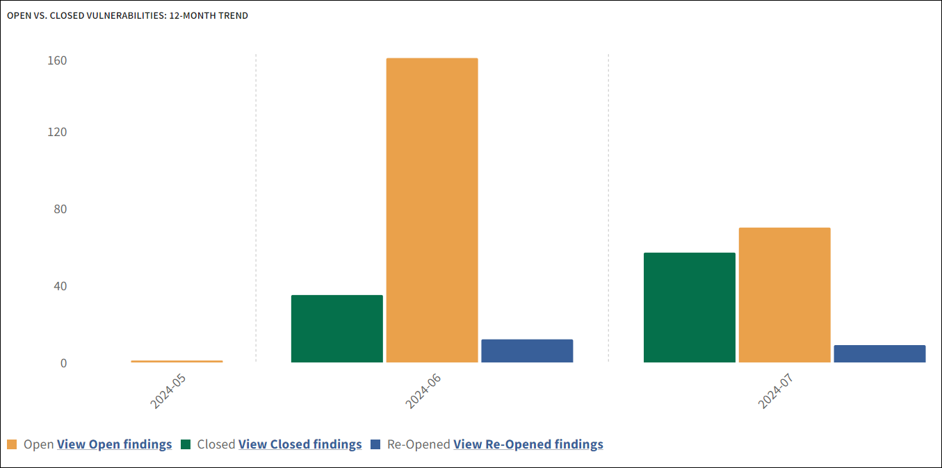
Click View Open findings at the bottom of the chart to be redirected to the Findings tab, which lists all findings with an Open status. Similarly, you can click the other two view links to access their respective lists.