Analytical charts in Reports
Analytical charts typically present patterns in complex data sets.
Available charts
| Icon | Chart name | Description |
|---|---|---|
|
|
Scatter | shows the relationship between two sets of data and can only be used if the data series are related |
|
|
Treemap | compares metric values to show hierarchical relationships |
|
|
Histogram | shows the number of times a given value occurs in the data set |
|
|
Box and Whisker | shows a quick overview of a series of values and their statistical properties |
|
|
Trellis |
a layout of smaller charts in a grid with consistent scales Each chart represents an item in a category. |
|
|
Heat Grid | plots the intensity of a metric across multiple categories |
When do you use them?
- Bubble and Scatter charts can be used for finding non-linear trends in data.
- Treemaps can be used to show hierarchical views of data and are useful for displaying trends.
- Histogram and Box and Whisker charts are useful for showing graphical representations of statistical data, and the distribution of continuous variables.
- Heat Grids can be used to display two-dimensional data sets with the intensity or color of the cell relating to the value it represents.
- Trellis charts are useful for analyzing large amounts of data.
Examples
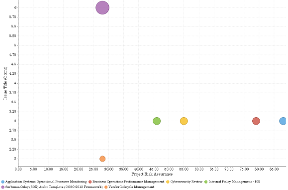
Your organization is tracking project data and needs to determine which projects have the highest number of issues and the lowest risk assurance score. Using a scatter chart, you visualize the issue count of each project and the risk assurance score:
Project risk assurance by issue count per project
Your organization is tracking issues data and needs to determine which issues are associated with the highest cost impact. Using a Treemap chart, you visualize the identified issues across multiple projects and their associated cost impact.
Issue title and cost impact
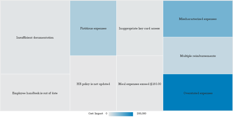
Chart configuration settings
Depending on the analytical chart selected, settings may vary.
The Reports interface prevents you from using data types that are unsupported and from building charts that do not include the mandatory settings.
On the Chart tab, configure the following settings:
| Setting | Description |
|---|---|
| Label |
the field used to split the chart into segments You can add multiple categories to display hierarchies. |
| Horizontal Axis | the field to use as the basis for the chart's horizontal scale |
| Vertical Axis |
the field to use as the basis for the chart's vertical scale |
| Color |
the field represented by the third data dimension to the chart Adding a third data dimension can sub-divide Horizontal Axis categories. You can think of the Color field as a break field. |
| Size |
the numeric field to use to determine the size of individual data points An increase in size indicates an increase in quantity or value. |
| Animation |
the datetime field used to animate the chart Each value of the animation field generates a unique frame in the animation. Note
To provide a label for each frame, format the chart title to display the animation field. |
| Trend | a user-defined metric used to display a trend line on the chart |
| Tool Tip | the field to be used for tool tip text |
| Auto Refresh |
turned on by default If you turn off this setting, you disable the chart preview and stop querying the database after each field change. |