Area charts in Reports
Area charts typically use three data dimensions, or variables, to compare trends or changes over time for two or more categories.
Available charts
| Icon | Chart name | Description |
|---|---|---|
|
|
Area | displays graphically quantitative data that typically compares two or more quantities |
|
|
Stacked Area | typically compares trends or changes over time for two or more categories, and also shows the proportion of the total that each category represents at any given point in time |
When do you use them?
Area charts compare historical trends or changes by showing the proportion of the total that each category represents at any given point in time. They communicate overall trends rather than individual values when comparing multiple data sets.
Examples
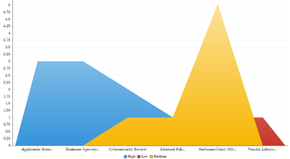
Your organization is tracking project data and needs to determine which projects have the highest issue severity. Using an area chart, you visualize each project and clearly demonstrate the associated issue severity information:
Issue severity by project
Your organization is tracking project data and needs to determine which projects have the highest issue severity. Using an area chart, you visualize each project and clearly demonstrate the associated issue severity information:
Issue severity by project
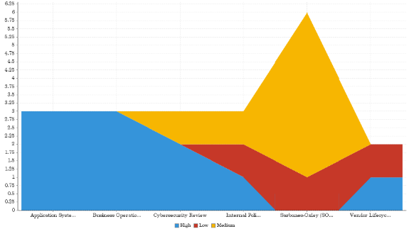
Chart configuration settings
The Reports interface prevents you from using data types that are unsupported and from building charts that do not include the mandatory settings.
On the Chart tab, configure the following settings:
| Setting | Description |
|---|---|
| Horizontal Axis | the field to use as the basis for the chart's horizontal scale |
| Vertical Axis |
the field to use as the basis for the chart's vertical scale |
| Color |
the field represented by the third data dimension to the chart Adding a third data dimension can sub-divide Horizontal Axis categories. You can think of the Color field as a break field. |
| Animation |
the datetime field used to animate the chart Each value of the animation field generates a unique frame in the animation. Note
To provide a label for each frame, format the chart title to display the animation field. |
| Auto Refresh |
turned on by default If you turn off this setting, you disable the chart preview and stop querying the database after each field change. |