Column charts in Reports
Column charts display data using vertical bars.
Available charts
| Icon | Chart name | Description |
|---|---|---|
|
|
Vertical Column | displays vertical lengths proportional to the values they represent |
|
|
3D Vertical Column | similar to the Vertical Bar chart, but in a three-dimensional format |
|
|
Stacked Vertical Column | displays the relationship of individual items to the whole |
|
|
Cylinder | similar to a Vertical Bar chart, but has components shown in cylindrical form |
|
|
3D Stacked Column | similar to a 3D Stacked Vertical Bar chart, but in three-dimensional format |
|
|
Layered Column | compares the contribution of each value to a total across categories |
When do you use them?
Column charts are useful for showing data changes over a period of time, or for illustrating comparisons among categories. Typically, categories are organized along the horizontal axis and values are organized along the vertical axis.
Examples
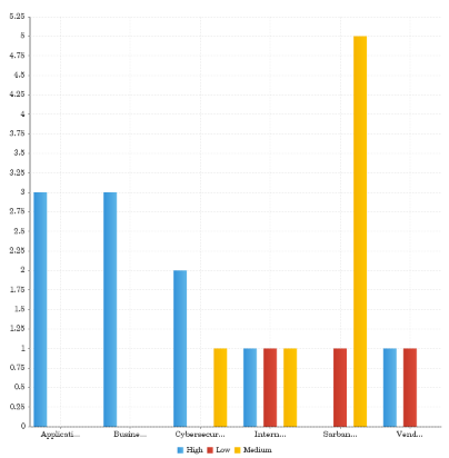
Your organization is tracking project data and needs to determine which projects have the highest issue severity. Using a vertical bar chart, you visualize each project and clearly demonstrate the associated issue severity information:
Issue severity by project
Your organization is tracking project data and needs to determine which projects have the highest issue severity. Using a 3D vertical bar chart, you visualize each project and clearly demonstrate the associated issue severity information:
Issue severity by project

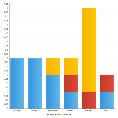
Your organization is tracking project data and needs to determine which projects have the highest issue severity. Using a stacked vertical bar chart, you visualize each project and clearly demonstrate the associated issue severity information:
Issue severity by project
Your organization is tracking project data and needs to determine which projects have the highest issue severity. Using a cylinder chart, you visualize each project and clearly demonstrate the associated issue severity information:
Issue severity by project
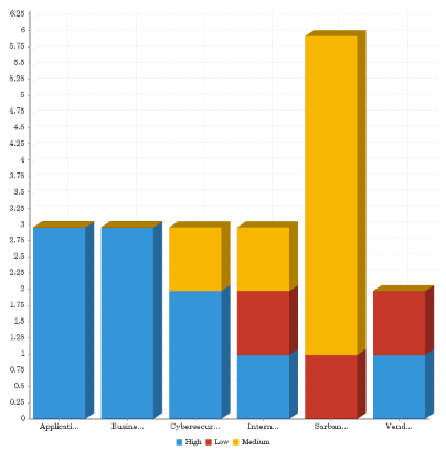
Your organization is tracking project data and needs to determine which projects have the highest issue severity. Using a 3D stacked vertical bar chart, you visualize each project and clearly demonstrate the associated issue severity information:
Issue severity by project
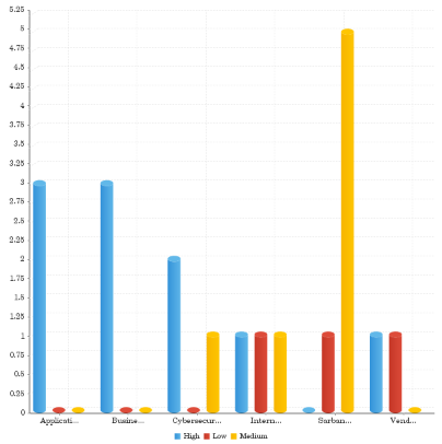
Your organization is tracking project data and needs to determine which projects have the highest issue severity. Using a layered bar chart, you visualize each project and clearly demonstrate the associated issue severity information:
Issue severity by project

Chart configuration settings
The Reports interface prevents you from using data types that are unsupported and from building charts that do not include the mandatory settings.
On the Chart tab, configure the following settings:
| Setting | Description |
|---|---|
| Horizontal Axis | the field to use as the basis for the chart's horizontal scale |
| Vertical Axis |
the field to use as the basis for the chart's vertical scale |
| Color |
the field represented by the third data dimension to the chart Adding a third data dimension can sub-divide Horizontal Axis categories. You can think of the Color field as a break field. |
| Animation |
the datetime field used to animate the chart Each value of the animation field generates a unique frame in the animation. Note
To provide a label for each frame, format the chart title to display the animation field. |
| Auto Refresh |
turned on by default If you turn off this setting, you disable the chart preview and stop querying the database after each field change. |