Combination charts in Reports
Combination charts display data using vertical or horizontal bars, usually combined with a line chart.
Available charts
| Icon | Chart name | Description |
|---|---|---|
|
|
Vertical Combined | You want to highlight values for easy comparison and plot your numbers vertically. Use these to place less emphasis on time and focus on comparing values. |
|
|
Vertical Overlay | Use the line chart to emphasize a trend and bars to emphasize specific values. Line / Bar combinations may work better by de-emphasizing bars through the use of subtle colors. |
|
|
Horizontal Overlay | Use the line chart to emphasize a trend and bars to emphasize specific values. Line / Bar combinations may work better by de-emphasizing bars through the use of subtle colors. |
|
|
Horizontal Combined | Combination charts, in effect, superimpose one chart type above or below another. Use to improve clarity and highlight relationships between data sets. |
When do you use them?
A combination chart shows two types of charts in a single graph. A combination of bars and lines in the same visualization can be useful when comparing values in different categories since the combination gives a clear view for comparison..
Examples
A sports organization is tracking invoiced data for athletes over a period of time. Using a combination chart, you visualize the number of athletes with respect to the invoiced amount yearly over a period of time:
Yearly invoice of athletes over a period of time
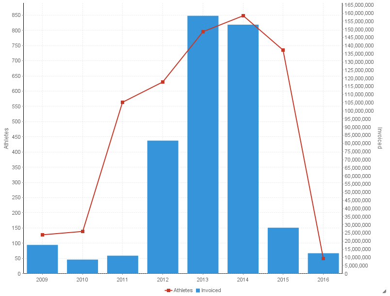
Chart configuration settings
The Reports interface prevents you from using data types that are unsupported and from building charts that do not include the mandatory settings.
On the Chart tab, configure the following settings:
| Setting | Description |
|---|---|
| Horizontal Axis | the field to use as the basis for the chart's horizontal scale |
| Vertical Axis |
the field to use as the basis for the chart's vertical scale |
| Color |
the field represented by the third data dimension to the chart Adding a third data dimension can sub-divide Horizontal Axis categories. You can think of the Color field as a break field. |
| Animation |
the datetime field used to animate the chart Each value of the animation field generates a unique frame in the animation. Note
To provide a label for each frame, format the chart title to display the animation field. |
| Auto Refresh |
turned on by default If you turn off this setting, you disable the chart preview and stop querying the database after each field change. |