Line charts in Reports
Line charts show trends or changes over time by displaying a series of data points connected by straight line segments. You can display one or more series in a line chart.
Available line charts
| Icon | Chart name | Description |
|---|---|---|
|
|
Line | typically shows or compares trends or changes over time for one or more categories |
|
|
3D Line | similar to a Line chart, but in three-dimensional format |
|
|
Z-Chart | displays the data, cumulative total, and moving total and is used for representing trends over a short period of time |
|
|
Stepped | displays trends or changes over time in the form of steps |
When do you use them?
Use line charts to track changes over short or long periods of time and to assist in predictive data analysis. If small, frequent changes exist in the series, line charts are more effective than bar charts at visualizing the change over time.
Line charts are also useful for comparing changes over the same period of time for multiple groups or categories.
Examples
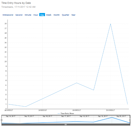
You need to visualize timesheets data pertaining to multiple projects to show the total number of time hours entered by date. Using a line chart, you visualize the total number of time hours entered by date.
Your organization is tracking the number of key controls that have been documented per project, and needs to determine the projects that have the lowest and highest number of key controls. Using a 3D line chart, you visualize the projects and clearly demonstrate the number of key controls per project:
Key controls per project
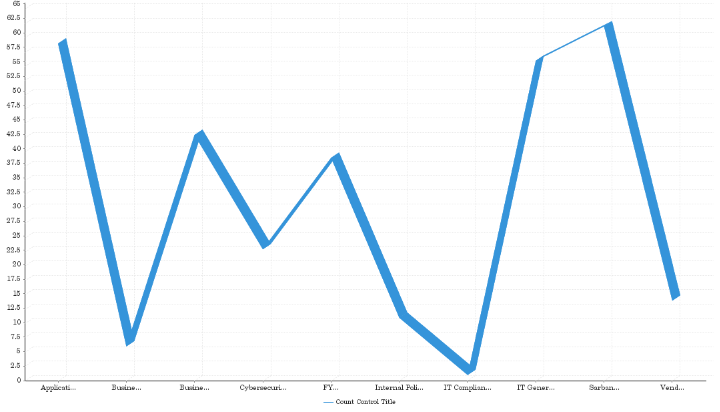
Chart configuration settings
Depending on the line chart selected, settings may vary.
The Reports interface prevents you from using data types that are unsupported and from building charts that do not include the mandatory settings.
On the Chart tab, configure the following settings:
| Setting | Description |
|---|---|
| Horizontal Axis | the field to use as the basis for the chart's horizontal scale |
| Vertical Axis |
the field to use as the basis for the chart's vertical scale |
| Color |
the field represented by the third data dimension to the chart Adding a third data dimension can sub-divide Horizontal Axis categories. You can think of the Color field as a break field. |
| Animation |
the datetime field used to animate the chart Each value of the animation field generates a unique frame in the animation. Note
To provide a label for each frame, format the chart title to display the animation field. |
| Auto Refresh |
turned on by default If you turn off this setting, you disable the chart preview and stop querying the database after each field change. |