Pie charts in Reports
Pie charts show categories as a proportion or a percentage of the whole. Use pie charts to show the composition of categorical data with each segment proportional to the quantity it represents.
Available charts
| Icon | Chart name | Description |
|---|---|---|
|
|
Pie | shows categories as a proportion or a percentage of the whole |
|
|
3D Pie | similar to a Pie chart, but in three-dimensional format |
|
|
Multi Pie | used to highlight individual component sizes in a system of multiple components |
|
|
Ring | similar to a Pie chart, but with a white space in the middle of the chart |
When do you use them?
Pie charts are effective when comparing parts of a whole for a static period. They do not show change over time.
Consider using a pie chart if you are working with:
- one data set pie charts are effective for categorizing and comparing one data set
- positive values pie charts cannot display zeros and can be confusing when working with negative values
- seven or fewer categories it becomes increasingly difficult to perceive the relative size of each segment when working with more than seven categories
Examples
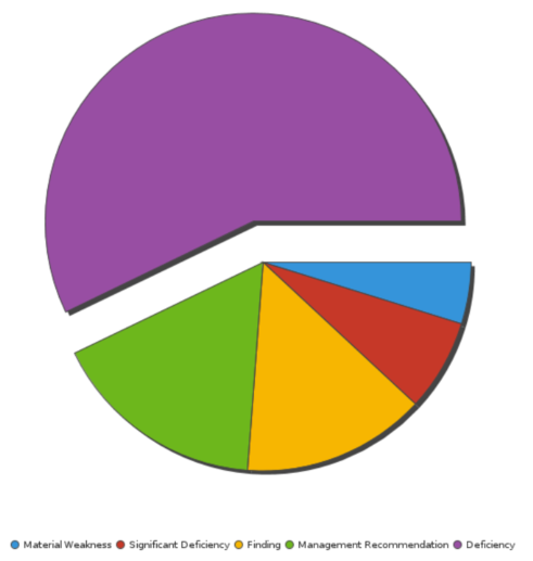
Your organization is tracking project data and needs to determine the percentage of issues by type. Using a pie chart, you visualize issues and clearly categorize each issue by type:
Issues by type
Your organization is tracking project data and needs to determine the percentage of issues by type. Using a 3D pie chart, you visualize issues and clearly categorize each issue by type:
Issues by type

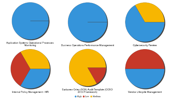
Your organization is tracking project data and needs to determine issue severity by project. Using a multi pie chart, you visualize issues and clearly categorize the severity ratings by project:
Issue severity by project
Your organization is tracking project data and needs to determine the percentage of issues by type. Using a ring chart, you visualize issues and clearly categorize each issue by type:
Issues by type
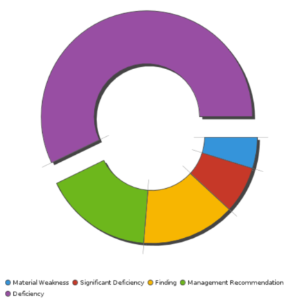
Chart configuration settings
Depending on the pie chart selected, settings may vary.
The Reports interface prevents you from using data types that are unsupported and from building charts that do not include the mandatory settings.
On the Chart tab, configure the following settings:
| Setting | Description |
|---|---|
| Color |
the field represented by the third data dimension to the chart Adding a third data dimension can sub-divide Horizontal Axis categories. You can think of the Color field as a break field. |
| Size |
the numeric field to use to determine the size of individual data points An increase in size indicates an increase in quantity or value. |
| Label | the label to be displayed when you roll over your mouse on specific data points |
| Animation |
the datetime field used to animate the chart Each value of the animation field generates a unique frame in the animation. Note
To provide a label for each frame, format the chart title to display the animation field. |
| Auto Refresh |
turned on by default If you turn off this setting, you disable the chart preview and stop querying the database after each field change. |