Showing reports on dashboards
A dashboard is a communication platform that displays key reports in a single presentation. You can create dashboards to present information to different stakeholders. Dashboards provide support for multiple types of content objects including reports, filters, interactive buttons, images, text, and icons.
How it works
Dashboards allow you to display multiple tables and / or charts on a single page, and use tabs to organize reports by subject and type. A typical dashboard is designed with high level reports, with the ability to drill down to more detail, when required.
Displaying tables and charts from the same report
Reports can contain a table and multiple charts. When you add a report to a dashboard, you can either display the table or the chart, but not both. In order to display both a table and a chart from the same report, you must copy the report, and add both reports to the dashboard (one can display the table and the other can display the chart).
Tips for designing dashboards
Dashboards are essential to helping people understand the story within the data. Placing the data in a visual context helps patterns, trends, and correlations emerge that might otherwise go unnoticed.
To make sure your dashboards tell compelling stories, follow these best practices.
Know your audience
Before you start designing a dashboard, consider who the primary audience is for the visual representation of the data.
Make sure the dashboard answers the questions that are most important to the primary audience. Resist the temptation to create dashboards that meet the needs of any and all potential audiences as this may make the message for your intended audience less clear.
To design for your audience, ask yourself these key questions:
- who is my primary audience?
- how will my audience view this dashboard?
- what actions do I want the audience to take based on this data?
Provide context
Data trends and patterns are best demonstrated in the context of larger goals and metrics. By presenting your data visualizations within a dashboard context, a better story emerges from your data and stakeholders can draw clearer conclusions:
- use color to imply meaning
- compare data to metrics or goals
- ensure data periods are clearly indicated
Keep it simple and clear
Your audience has a short attention span. If your dashboard cannot be clearly understood within 15 to 30 seconds, your audience may miss the point. Use the following tips to simplify your dashboards and improve clarity:
- use white space to make labels and chart components distinct
- write descriptive labels and headings so that nothing is ambiguous
- align chart colors with the meaning you are trying to convey
- keep text short and simple so it is easy to read
- tell one story at a time to avoid confusing your audience
- limit the number of tables and visualizations on your dashboard to 3-5
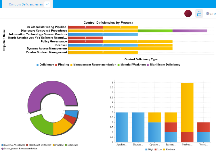
Example
Dashboard: Control Deficiencies and Issues
Scenario
You need to visualize control deficiencies and detailed issues data. You want to be able to present this information to key external stakeholders as a summary, and allow them to quickly extract the information as it relates to multiple projects.
Process
You previously created two reports that both contain a table and a few charts. To visually illustrate this data at a high-level, you create a dashboard tab and add the following charts to the dashboard:
- Control Deficiencies by Process
- Issues by Type Donut Chart
- Issues Severity by Project Stacked Bar Chart
Result