Showing reports on presentations
In the Reports app, a presentation is a communication platform that displays multiple tables, charts, and rich content in a single presentation.
Present replaces Storyboard as the presentation module. Existing storyboards will remain but as read-only.
How it works
Presentations display tables, charts, and rich content, including images and videos, in a series of slides. You can create presentations to summarize data findings, trends, or patterns, and present the information to key stakeholders.
Once you add a table or chart to the presentation, any updates made to the table or chart automatically display when you open the presentation.
Tips for designing presentations
Presentations are essential to helping people understand the story within the data. Placing the data in a visual context helps patterns, trends, and correlations emerge that might otherwise go unnoticed.
To make sure your presentations tell compelling stories, follow these best practices.
Know your audience
Before you start designing a presentation, consider who the primary audience is for the visual representation of the data.
Make sure the presentation answers the questions that are most important to the primary audience. Resist the temptation to create presentation that meet the needs of any and all potential audiences as this may make the message for your intended audience less clear.
To design for your audience, ask yourself these key questions:
- who is my primary audience?
- how will my audience view this presentation?
- what actions do I want the audience to take based on this data?
Provide context
Data trends and patterns are best demonstrated in the context of larger goals and metrics. By showing your data visualizations within a presentation context, a better story emerges from your data and stakeholders can draw clearer conclusions:
- use color to imply meaning
- compare data to metrics or goals
- ensure data periods are clearly indicated
Keep it simple and clear
Your audience has a short attention span. If your presentation slides cannot be clearly understood within 10 to 15 seconds, your audience may miss the point. Use the following tips to simplify your presentation slides and improve clarity:
- use white space to make labels and chart components distinct
- write descriptive labels and headings so that nothing is ambiguous
- align chart colors with the meaning you are trying to convey
- keep text short and simple so it is easy to read
- tell one story at a time to avoid confusing your audience
- limit the number of tables and visualizations on each presentation slide to 1-2
Example
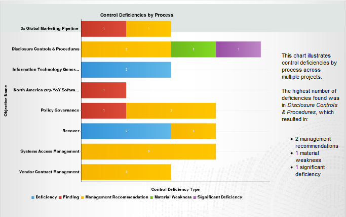
Presentation: Control Deficiencies by Process
Scenario
You need to visualize your findings that pertain to control deficiencies by process. You want to be able to present this information to key external stakeholders as a summary, and allow them to quickly extract the information as it relates to multiple projects.
Process
You previously created a report that contains a horizontal bar chart that summarizes control deficiencies by process. To visually illustrate this data, you create a presentation, and add a content slide that contains the Control Deficiencies by Process chart. You supplement the chart with a text description.
Result