Dashboards in Risk Manager
The Risk Manager home page displays a workflow status chart and a risk heatmap. These visuals provide a comprehensive view of your risks, helping you identify, prioritize, and mitigate them effectively, enabling informed, strategic decision-making.
Types of charts in Risk Manager
The home page includes the following charts:
- Workflow status This donut chart shows the total number of risks by workflow status. Select the Filter by workflow status link to view risks that match a specific status.
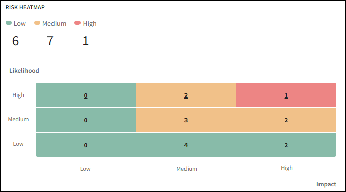
- Risk heatmap This heatmap displays risks based on their final risk rating, determined by the Likelihood and Impact fields.
Each cell in the heatmap represents a risk category, such as Low, Medium, or High. The number in each cell indicates how many risks fall into that category.
For example, in the heatmap below, the number 2 in the center cell of the top row (colored amber) indicates two Medium risks with High Likelihood and Medium Impact.
The summary in the top-left corner of the heatmap shows the total number of risks in each category. For instance, a total of 7 risks in the Medium category would be shown in amber.
For more information about heatmaps, see Risk heatmap
Risk heatmap
The risk heatmap visualizes risks based on the final risk ratings selected in the Likelihood and Impact fields. You can complete these fields on the Risk Details page.
Risk heatmap matrix
The risk heatmap is generated in different matrix combinations such as 3 x 3, 4 x 4, and 5 x 5, depending on the number of options available in the Likelihood and Impact fields.
For example, when both Likelihood and Impact fields include 3 options (Low, Medium, and High), then a 3 x 3 matrix is generated.
| Likelihood | High | Low | Medium | High |
|---|---|---|---|---|
| Medium | Low | Medium | Medium | |
| Low | Low | Low | Low | |
| Low | Medium | High | ||
| Impact | ||||
Colors in the heatmap
Each risk level in a 3 x 3 matrix is represented by a specific color:
- Green = Low risk
- Amber = Medium risk
- Red = High risk
A 4 x 4 matrix is includes four colors, and a 5 x 5 matrix includes five colors.
Risk counts in the heatmap
The top-left section of the heatmap displays the total number of risks in each category (such as Low, Medium, or High).
To calculate the total number of risks for a category, the heatmap adds the number of risks in all cells with the corresponding color. For example, all risks in amber-colored cells are added together to show the total number of Medium risks.
Determining the risk level
Risk level is calculated based on the Likelihood and Impact values.
The following table shows the risk level for different options of likelihood and impact in a 3 x 3 matrix.
| Likelihood | Impact | Risk level |
|---|---|---|
| High | Low | Low |
| High | Medium | Medium |
| High | High | High |
| Medium | Low | Low |
| Medium | Medium | Medium |
| Medium | High | Medium |
| Low | Low | Low |
| Low | Medium | Low |
| Low | High | Low |
Heatmap configuration
The 3 x 3 matrix is the default configuration. We'll take care of the initial setup for you. You can customize the Likelihood and Impact fields by changing option names or adding more levels. For assistance, contact your Diligent representative or Support.
The following are examples of 4 x 4 and 5 x 5 matrix heatmaps.
If the Likelihood and Impact fields include four options (for example, Very Low, Low, Medium, High), a 4×4 matrix is generated.
The logic for calculating risk level remains the same. For example, if Likelihood is Medium and Impact is High, the risk level is Medium.
| Likelihood | High | Very Low | Low | Medium | High |
|---|---|---|---|---|---|
| Medium | Very Low | Low | Medium | Medium | |
| Low | Very Low | Very Low | Very Low | Low | |
| Very Low | Very Low | Very Low | Very Low | Low | |
| Very Low | Low | Medium | High | ||
| Impact | |||||
If the Likelihood and Impact fields include five options (for example, Very Low, Low, Medium, High, and Critical), a 5×5 matrix is generated.
The risk level is determined using the same logic. For example, a risk with Medium Likelihood and High Impact is considered Medium risk.
| Likelihood | Critical | Very Low | Low | Medium | High | Critical |
|---|---|---|---|---|---|---|
| High | Very Low | Low | Medium | Medium | High | |
| Medium | Very Low | Low | Low | Medium | Medium | |
| Low | Very Low | Very Low | Low | Low | Low | |
| Very Low | Very Low | Very Low | Very Low | Very Low | Very Low | |
| Very Low | Low | Medium | High | Critical | ||
| Impact | ||||||