Using function fields in charts
In the Reports app, function fields create a new field in a chart that is based on a report field that already has a function applied to it. Use function fields in charts to include aggregate measures such as trends, averages, and variances.
How it works
A function field is a tool that performs complex calculations or operations on a report field that already has a function applied to it. Function fields accept an input and return an output.
Example
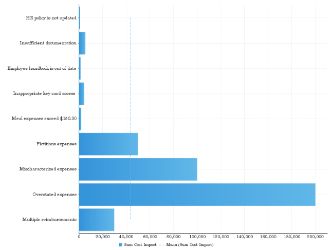
Scenario
You want to visualize the average cost impact for issues identified across multiple projects.
Process
You create a horizontal bar chart, and include the following fields in your chart:
- Horizontal Axis Sum Cost Impact
- Vertical Axis Issue Title
You add the Average function field in the chart and apply it to Sum Cost Impact.
Result
The average cost impact for issues across multiple projects is indicated by the dotted blue line in the chart:
Average cost impact for issues
Permissions
Only Report Admins and Report Writers can add a function field to a chart.
Add a function field to a chart
-
From the Platform home page (www.highbond.com), select the Reports app to open it.
If you are already in Diligent One, you can use the left-hand navigation menu to switch to the Reports app.
- Open the appropriate report and click Edit > Charts.
- Click on the thumbnail of the appropriate chart at the bottom of the screen.
The chart displays in the preview window.
- Drag the appropriate function field from the Functions list to your chart building area, and configure any of the settings, as required.
Tip
You can apply basic function fields, such as average, trend, forecast, and accumulation, to advanced function fields (set analysis or variance). Click the down arrow
 next to the advanced function field, select Add Function, and select a basic function field.
Available function fields
Average
| Type | Description |
|---|---|
| Mean | displays a line calculated as the sum of all values, divided by the number of values in the chart |
| Median |
displays a line calculated by ordering all the values in ascending order and using the middle value This can be a more useful measure than mean if the data contains extreme outliers. |
| Mode | displays a line calculated by finding the value which occurs most in the chart |
Trend
| Type | Description | Associated settings |
|---|---|---|
| Auto Trend | similar to Auto Chart, applies an automatic trend function to the chart based on complex algorithms |
|
| Moving Average |
displays the mean, calculated using values from a set number of periods before each point For example, if your chart contains 10 periods, a moving average may be set to use 5 at a time. This can be used to follow changes in the data on a line that is smoother than the actual values, making it useful when displaying trends for noisy (spikey) data. |
|
| Linear Regression |
displays a straight line that indicates the relationship between the values on the x and y axes This can be useful to give an idea of the general trend of data. |
|
| Polynomial Regression |
displays a curved line to the data which indicates the relationship between the values on the x and y axes This can be used where the relationship between the values is not completely linear, for example if your trend has significant fluctuations through it. |
|
Forecast
| Type | Description | Associated settings |
|---|---|---|
| Auto Trend | similar to Auto Chart, applies an automatic trend function to the chart based on complex algorithms |
|
| Simple Exponential Smoothing |
displays a forecast based on the average of previous values in the data set, with weighting defined by alpha (recent vs historic data) This is useful or forecasting data which has no general trend or seasonality. |
|
| Double Exponential Smoothing |
displays a forecast based on the average of previous values in the data set, with weighting defined by alpha (recent vs historic data) and beta (trend) This is useful for forecasting data which has a general trend, but no seasonality. |
same as Simple Exponential Smoothing, with the addition of: Beta specifies how much weight is given to the trend of the data The higher the beta value, the more weight is given to the data's trend. |
| Triple Exponential Smoothing |
displays a forecast based on the average of previous values in the data set, with weighting defined by alpha (recent vs historic data), beta (trend), and gamma (seasonality) This is useful for forecasting data which has a general trend and varies seasonally. Triple exponential smoothing requires at least two years of data for its seasonality calculations. |
same as Double Exponential Smoothing, with the addition of: Gamma specifies how much weight is given to the seasonality (what happened in corresponding periods of previous years) The higher the gamma, the more weight is given to the data's seasonality. |
| Moving Average |
displays the mean, calculated using values from a set number of periods before each point For example, if your dataset contains 10 periods, a moving average may be set to use 5 at a time. This can be used to follow changes in the data on a line that is smoother than the actual values, making it useful when displaying trend for noisy (spikey) data. |
|
Accumulation
The Accumulation function field displays an accumulative percentage of the total line on the chart, using a secondary axis.
Set Analysis
The Set Analysis function field displays a subset of the data contained within a specified field.
To define a Set Analysis function field, you need to select a report metric field to base the results on, and specify the range of filters that will be applied solely to the field within the chart.
| Setting | Description |
|---|---|
| Set Name | specifies the display name of the resulting set analysis field, used in the chart labels and / or legend |
| Set Metric |
allows you to select the field to filter down to your specified set Only metric fields included in your report are available in this list. |
| Filter |
allows you to specify the filters to be applied to your set field For more information, see Configuring filters in reports. |
Variance
The Variance function field displays the difference between two fields from either the table or chart. Variance can be displayed as either the calculated value, or a percentage difference.
| Setting | Description |
|---|---|
| Variance Name | specifies the display name of the resulting variance field, used in the chart labels and / or legend |
| Variance Between |
allows you to select two fields to apply the variance calculation to The values in the second field are subtracted from the values in the first field, as part of the calculation, so order is important. There are two types of field available to be used as part of a variance:
|
| Display Variance as |
allows you to select how the resulting variance values are displayed:
|