Creating dashboards
Create a dashboard to present information to different stakeholders. Dashboards provide support for multiple types of content objects including reports, filters, interactive buttons, images, text, and icons.
Permissions
Only Report Admins and Report Writers can create and delete dashboards.
Understanding the Dashboard Builder
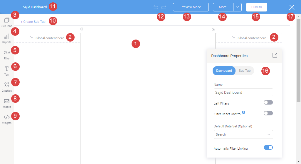
The following screenshot shows the dashboard builder.
Options
|
Number |
Option | Description |
|---|---|---|
| 1 | Dashboard sub tab template |
The center area of the dashboard displays the sub tab template. This could either be the dashboard canvas or a static layout. The dashboard canvas has a flexible layout that allows you to drop objects such as reports, filters, texts, images, and shapes anywhere; whereas, a static layout has less flexibility but are simpler to build. |
| 2 | Global content container |
Content containers on either side of the sub tab. You can drop global objects that are visible on the entire dashboard and not just the specific sub tabs. The position of these objects is fixed. Tip
The global content containers are ideal for adding filters |
| 3 | Sub tab button | Manage sub tabs contained in this dashboard. You can view a list of sub tabs, reorder them, create or copy a sub tab. |
| 4 | Report Widgets |
Search and add existing reports to the dashboard. |
| 5 | Filter Widgets |
Drag and drop filter widgets to add filters on the dashboard. |
| 6 | Text widgets | Drag and drop text widgets to your dashboard. |
| 7 | Graphic widgets* |
Drag and drop graphical elements such as icons to your dashboard. Note
Shapes and lines are not supported. |
| 8 | Image widgets* |
Drag and drop preexisting images or new images added through the Image Manager. |
| 9 | Code Widgets* |
Add Code Widgets or Action Buttons to your dashboard. |
| 10 | Create sub tab |
Click on this option to add another sub tab to your dashboard. |
| 11 | Dashboard name |
Shows the name of the dashboard. Double-click here to update the dashboard name. |
| 12 | Undo, Redo |
Allows you to undo or redo the last few changes done on the canvas. |
| 13 | Preview button |
Click to see the preview and test the dashboard before publishing. |
| 14 | More button |
This button lets you perform the following actions on the dashboard:
Caution Deleting a dashboard is irreversible and cannot be undone. |
| 15 | Publish button |
Use this option to publish the dashboard, making it accessible to other users. |
| 16 | Properties panel |
This panel displays configuration properties for the dashboard or any selected object. You can use this to configure and customize the selected dashboard object, including changing color, font, background, positioning, size and other details. Note that this panel can be easily moved, hidden and expanded again. For more information, see Dashboard Properties / Report Properties. |
| 17 | Exit |
Exits the dashboard builder. When exiting, the following options appear.
|
* Marked items are only supported in the dashboard canvas layout.
Dashboard Properties
The following table shows the options available on the Dashboard Properties panel.
|
Property name |
Description |
|---|---|
| Name |
View or update the name of the dashboard |
| Left filters |
Allows you to hide or display the button for left side navigation filters on your dashboard. |
| Filter Reset Control | If enabled, the Reset button in a Filter Widget control panel will reset the entire dashboard to its original state. This will reset all filters, and other dashboard interactions, including drill functions, applied by the user. |
| Default Data Set |
This optional setting allows you to specify a default view or data set for your dashboard. |
| Automatic filter linking |
Allows you to automatically link your dashboard filters when is enabled. |
Create a dashboard tab
-
From the Platform home page (www.highbond.com), select the Reports app to open it.
If you are already in Diligent One, you can use the left-hand navigation menu to switch to the Reports app.
- To create a new dashboard tab, perform the following steps:
- Click Create, select Dashboard.
The Create New Dashboard dialog box opens.
- Enter a name for the dashboard tab now, or do it later.
- Under Choose Layout, select either one of the dashboard layouts or the default dashboard canvas and click Create.
Note
The dashboard canvas has a flexible layout that allows you to drop objects such as reports, filters, and images anywhere; whereas, a static layout has less flexibility but are simpler to build.
A new dashboard tab is created.
- Click Create, select Dashboard.
- To copy a dashboard tab that currently exists on your personal dashboard, perform the following steps:
- Click the down arrow
 next to the tab name, and select Copy.
 - In the confirmation pop-up, click Ok.
The copied dashboard tab opens.
- Click the down arrow
Add reports to the dashboard
-
From the Platform home page (www.highbond.com), select the Reports app to open it.
If you are already in Diligent One, you can use the left-hand navigation menu to switch to the Reports app.
- Open an existing dashboard.
- Open the dashboard in edit mode (select > Edit), and click Reports
 .
.The side panel opens.
- Enter a search term to find a report to add to the dashboard tab or click on the Advanced link for filtering options.
You can view detailed information about reports by hovering your mouse over any report and clicking
 .
. - Drag and drop the report to the dashboard content area.
Result - The selected report is added to the tab.
NoteIf the report contains multiple content types such as multiple charts or tables, then you can select visualization you want to add.
TipAfter adding the report, you can customize it using the Properties panel by clicking on the report widget. For more information, see Report Properties
You can further manage the widgets by right-clicking and using the menu that appears.
- Optional. Click + Create Sub Tab to create a new sub tab, and click Sub Tabs to manage the sub tabs.
- Optional. Click Filter to add filters to the dashboard.
- Optional. Click Text to add text to the dashboard.
- Optional. Click Graphics to add icons to the dashboard.
Note
Shapes and lines are not supported.
- Optional. Click Images to add preexisting images or new images added through the Image Manager.
- Optional. Click Widgets to add Code Widgets and Buttons to the dashboard.
- Optional. Click Preview Mode to check your dashboard before publishing.
After adding any item such as filters, graphics, or images, you can customize it using the Properties panel by clicking on the widget. You can further manage the widgets by right-clicking and using the menu that appears.
Report Properties
The following table shows the options available on the Report Properties panel.
Property options will differ based on the selected dashboard template; the dashboard layouts will have limited properties options, whereas the canvas will have all.
|
Property name |
Supported Template | Description |
|---|---|---|
| Name | Canvas & static layouts |
Allows you to edit the default report name. |
| Hide Report Name | Canvas & static layouts |
By default, the report name will be hidden on the canvas. Toggle this to show/hide the report name. When shown, the report name appears directly above the report and cannot be formatted. |
| Report type | Canvas & static layouts |
Allows you to change the report’s content type. Example, if your report has multiple charts, you can choose which one to display on the dashboard. |
| Refresh | Canvas & static layouts |
Enable this toggle to allow your report to be refreshed periodically once the dashboard is published. |
| Refresh time | Canvas & static layouts |
If opting to refresh reports, define frequency of time (in seconds) that the report should be refreshed. |
| Link interactions | Canvas & static layouts |
This button allows you to enable and link interactions to your report, such as drilling, or brushing. To do this, your report must be set up beforehand to allow for these interactions. For example, to perform drilling, the report must have data hierarchy that takes it from one level to another level. |
|
Report Menu |
||
| Show Report Menu | Canvas & static layouts |
This controls the visibility of the report object menu at the individual report level. Options include:
Note that the individual report level setting will override menu visibility setting at the canvas level. You can further control each of the report widget menu options by choosing to display or hide them using the following configurations. |
| Export and Print | Canvas & static layouts |
Enable this toggle to show the |
| Open Report | Canvas & static layouts |
Enable this toggle to show the |
| Toggle Display Type | Canvas & static layouts |
Enable this toggle to show the option to switch the display between chart or table in the report widget menu. Note that the toggle option will only appear for reports that contain a single chart and table. |
| Drill Controls | Canvas & static layouts |
Enable this toggle to show the drill up or drill reset options that appear in the report widget menu when a drill function is applied on the report. |
|
Interactions |
||
| Allow interactions | Canvas & static layouts |
Enable this toggle to allow interactions to be performed on the chart. This toggle allows you to display additional toggles, so you can choose the exact interaction functionality to be enabled on a chart. |
| Brushing | Canvas & static layouts |
Allows users to perform brushing on a chart if enabled. The chart must have brushing capabilities set up prior. |
| Drill down | Canvas & static layouts |
Allows users to perform drill down on a chart if enabled. The chart must have drill down capabilities set up prior. |
| Drill path | Canvas & static layouts |
Allows users to use the drill path on a report if enabled. |
|
Size & location |
||
| X | Canvas |
Specify the x coordinates of the upper-left corner of the report, in order to position it exactly on your dashboard canvas. |
| Y | Canvas |
Specify the y coordinates of the upper-left corner of the report, in order to position it exactly on your dashboard canvas. |
| Width | Canvas |
Specify the width of the currently selected report, in pixels, in order to resize it exactly. |
| Height | Canvas & static layouts |
Specify the height of the currently selected report, in pixels, in order to resize it exactly. |
| Corners | Canvas |
This option allows you to define the roundness of your report border corners. For maximum circular edges, enter half the value of the widget height. For example, if the height is 400 pixels, then set the edge value to 200 pixels. Moreover, any value greater than 200 for the edge, will not have any further effect in this example. |
| Aspect ratio | Canvas |
Enable this toggle to maintain the aspect ratio. This means when increasing or decreasing the report size, it maintains its shape (i.e. the relationship between its width and height). If this is disabled, the report can be stretched out of shape either vertically or horizontally. |
| Lock widget | Canvas |
Enable this toggle to lock the report in its location. This stops you from moving or resizing it. This holds true even when selecting multiple widgets on the canvas. Note that the report widget can still be customized. |
|
Background formatting |
||
| Background color | Canvas |
Allows you to specify a background color for the report. |
| Opacity | Canvas |
Allows you to specify the transparency of the report’s background color. |
| Customize padding | Canvas |
This option allows you to define a custom padding or buffer around the report, in pixels, when enabled. This includes padding for each side to the report. If disabled, you can still define an overall padding size. |
| Padding top | Canvas |
When custom padding is enabled, this allows you to define padding to be added to the top of the report. |
| Padding bottom | Canvas |
When custom padding is enabled, this allows you to define padding to be added to the bottom of the report. |
| Padding right | Canvas |
When custom padding is enabled, this allows you to define padding to be added to the right of the report. |
| Padding left | Canvas |
When custom padding is enabled, this allows you to define padding to be added to the left of the report. |
| Padding | Canvas |
This allows you to define an overall padding size for the report. This size, defined in pixels will be constant for each report side. To add different sized padding on any of the sides, enable the Customize Padding option. |
| Border width | Canvas |
This allows you to specify the thickness of the report border. Note that to make the border visible, you must define values for all three border properties. |
| Border style | Canvas |
This allows you to select a style for the report border such as dashed, solid, dotted, groove, and more. |
| Border color | Canvas |
This allows you to specify the color of the report border. |
| Horizontal shadow | Canvas |
This option allows you to drop a horizontal shadow on the report, by defining its size in pixels. |
| Vertical shadow | Canvas |
This option allows you to drop a vertical shadow on the report, by defining its size in pixels. |
| Shadow blur | Canvas |
This option allows you to define the sharpness of the report shadow. The smaller the value, the sharper and more defined the shadow will be. For a blurry or softer shadow, provide a bigger value. |
| Shadow color | Canvas |
This option allows you to set a color for the report shadow. |
|
Actions |
||
| Click Event | Canvas |
Select an event that will trigger when the selected report is clicked. Event options include:
|
| Report ID | Canvas |
If navigating to a report using the Go to report click event, provide the UUID of the report. |
| Sub Tab # | Canvas |
If navigating to a sub tab using the Go to sub tab click event, enter the order number of the sub tab. |
| URL | Canvas |
If navigating to an external page using the Go to URL click event, provide the full URL of the page. |
| Target | Canvas |
If navigating to an external page using the Go to URL click event, specify the page target. Options include:
Note
Parent Frame and Current Frame are not supported. |
 option for print and export in the report widget menu.
 option to open a report in the widget menu.
Edit a report from the dashboard
You can launch the report editing mode from the dashboard and return back to the dashboard after making the changes. To edit the report from the dashboard, perform the following steps:
- Click on a report in the dashboard content area.
- Click Transform
 in the upper-right corner of the report.
 - Select one of the following:
- Edit Report > Chart to open the Chart tab in the editing mode and click Ok to confirm.
- Edit Report > Data to open the Data tab in the editing mode and click Ok to confirm.
- Make all the required changes.
- Save the report:
- Click Publish
- Enter a name and description for the report.
- Specify the content folder and subfolder to define where the report will be saved.
- Specify the report access and distribution settings.
- Click Save > Activate.
- After activating the report, click Close
 to return back to the dashboard.
Save a dashboard
- Click Publish.
The Save Dashboard dialog box opens.
- Enter a name and description for the dashboard tab.
- Define where the dashboard tab will be stored by selecting the appropriate content folder and content sub folder.
- Optional. Click + Add tags to create tags that classify the dashboard tab, or select any existing tags to associate with the dashboard tab.Tip
You can use tags to quickly filter dashboard tabs on the Browse page.
- In the Dashboard Access, specify the access level required:
- Public all users that have access to the content sub folder where the dashboard tab is stored will have access to the dashboard tab
- Private only specific people and / or groups can access the dashboard tab
- If you selected Private, define the specific people and / or groups that can access the dashboard tab:
- Go to the User Access tab.
- Click in the Search box and select the users you want to give access.
- Once everything is done, save the dashboard tab:
- Save > Activate saves the dashboard tab and makes it available to users with the appropriate access
- Save > Draft saves the dashboard tab as a draft
Note
To Activate a dashboard, you must have content in all the Sub Tabs of the dashboard. If not, you can only save the dashboard as a Draft.
Rearrange the order of multiple dashboard tabs
-
From the Platform home page (www.highbond.com), select the Reports app to open it.
If you are already in Diligent One, you can use the left-hand navigation menu to switch to the Reports app.
- Select Dashboard in the top menu.
- Click the down arrow next to the dashboard tab name and click Move.
My Dashboards dialog box appears.
- Drag and drop the dashboards to arrange the order and click Apply.
Result The dashboard gets reordered accordingly.
Edit a dashboard
To edit a dashboard that is in active mode, do the following:
- Open the dashboard you want to edit and click the down arrow
 next to the dashboard and click Edit.
 - In the confirmation dialog box, click Ok.
Delete a dashboard
To delete a dashboard, do one of the following:
- In draft mode, click More > Delete Version, and click Delete to confirm.
- In active mode, do the following:
From the Platform home page (www.highbond.com), select the Reports app to open it.
If you are already in Diligent One, you can use the left-hand navigation menu to switch to the Reports app.
- Select Dashboard in the top menu.
- Click the down arrow next to the dashboard tab name > Delete, and click Delete to confirm.