Map chart
You can use a map chart to show data across different geographical locations.
When do you use it?
Using a map chart, you can visualize how different locations are performing on their respective parameters across the world.
Before you start
Before you plot a map chart, you must ensure your table contains columns with at least one of the following data:
- Continent names Names of the continents. For example, North America, Asia.
- Country codes ISO standard 2- or 3-letter alpha codes. For example, US and USA for the United States of America.
Columns in the table must contain either 2-letter or 3-letter alpha codes. Do not mix 2-letter and 3-letter codes in a single column.
- State codes ISO standard 2-letter alpha codes with the 2-letter country code prefixed to the state code. For example, US-CA for California in the United States.
For more information about ISO codes, see ISO_3166-1 and ISO_3166-2.
- Latitude and longitudes Coordinates of a region. For example, 37.0902 and -95.7129 for the United States.
Note
- If a column contains a mix of 2- and 3-letter country codes, the map chart plots using the 2-letter codes and the 3-letter codes are ignored.
- If a column contains a few invalid values, the map chart plots using only the valid values and the invalid ones are ignored. If there are no valid values, then a plain map chart is plotted.
Examples
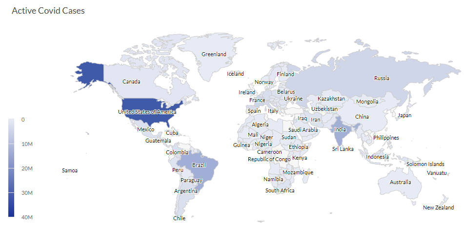
Map chart
Your company is tracking active Covid-19 cases across the globe. Using a map chart, you visualize and clearly demonstrate the active Covid-19 cases in each region across the globe.
Data configuration settings
-
From the Platform home page (www.diligentoneplatform.com), select the Results app to open it.
If you are already in Diligent One, you can use the left-hand navigation menu to switch to the Results app.
Note
Diligent One Platform also supports the domain www.highbond.com. For more information, see Supported domains.
- Navigate to the appropriate table.
- On the Configure
 panel, click Data and configure the following settings:
| Setting | Supported data types | Description |
|---|---|---|
|
Location |
|
Select a value for any one of the following:
|
|
Value |
numeric |
You can select a count of the Location field or one of several aggregate values for a different numeric column in the table:
Tip You can control decimals and rounding on numeric data by changing format of this field. For the Average aggregate option, Format options is available in the Data tab of the Configure Visualization panel. For all other aggregate options, format options set in Table View is applied. For help doing this, see Data formatting options. |
Chart display settings
-
From the Platform home page (www.diligentoneplatform.com), select the Results app to open it.
If you are already in Diligent One, you can use the left-hand navigation menu to switch to the Results app.
Note
Diligent One Platform also supports the domain www.highbond.com. For more information, see Supported domains.
- Navigate to the appropriate table.
- On the Configure panel, click Display and configure the following settings:
| Setting | Description |
|---|---|
| Options | |
| Show Values | Show or hide the data point values. |
| Enable double-click zoom |
Turn on or off zooming any area of the map by double-click. You can also drag the map in any direction after zooming in. |
| Show zoom button | Show or hide zoom buttons (+ and -). |
| Fixed tooltip | Show or hide tooltip in a fixed position. |
| Show gradient scale |
Show or hide the gradient scale. The Show gradient scale option is currently available only for map charts with region, i.e., when you select Region under Location field in the Data tab. It is not yet supported for maps with coordinates. |
| Style | |
| Map type |
Specifies the type of map you want to display:
Note When you plot a map chart using coordinates and select any of the above Map type except Continents and Countries, then you may see a few unrelated data points around the map depending on the coordinates. |
| Theme |
Specifies the theme you want to display:
Default is white. |
| Gradient color | |
| Color stops |
Specifies the type of gradient color stops you want to display:
Default is automatic. The Color stops option is currently available only for map charts with region, i.e., when you select Region under Location field in the Data tab. It is not yet supported for maps with coordinates. |
| Other settings | |
| Drill-down |
Click on any part of the map to drill down one level. For example, click on any continent to drill down and view its countries. Similarly, click on any country to drill down and view its states. Currently, drilling down from a country to its states works only for USA and China. Note A single click drills down one level, whereas a double-click will zoom in the map to get an enlarged view, if you have enabled double-click zoom. |