Interpretations and visualizations
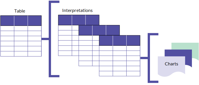
An interpretation is a bundled collection of filters, visualizations, and statistics based on a table in a collection. Use them to interpret and visualize results to gain a deeper understanding of the facts and insights hidden in the data.
How it works
Each table in your collection starts with a default interpretation. The default interpretation is the view provided for remediation and processing records. Any changes that are saved provide a preconfigured view that other users can access when processing records. You can also create new interpretations. Each interpretation provides a unique view of the data in the underlying source table. This structure lets you create multiple views of the data based on dimensions such as region, quarter, or any other category you use to organize and isolate data.
You can use the interpretations to create storyboards in the Storyboards app. You must save the interpretation (even the default interpretation) to use it in the Storyboards app.
Note
The ability to create and save interpretations depends on your assigned role. Only Professional Managers can customize and save a default interpretation. Both Professional Managers and Professional Users can create new interpretations.
The structure of interpretations
An interpretation contains a table view of the data that you can filter, sort, or format. You can then add one or more charts to the interpretation to visualize the data in the table view.
Each chart is based on the data in the table view and any changes you make in the table view are applied to the charts as well.
Reporting your findings
Once you create a set of interpretations and visualize your table data in charts, include the relevant charts and tables in storyboards to present your findings. Any filters or formatting you apply in the interpretation are applied within the storyboard.
For more information, see Overview of Storyboards.
Using the Visualization page
The Visualization page allows you to build graphic representations of table data. You open the Visualization page by clicking the name of the table that contains the data you want to visualize.
User interface overview
The Visualization page includes tabs and side panels. The side panels serve as the primary area for configuring your visualization.
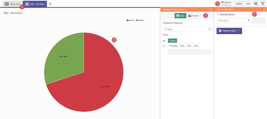
| Number | UI Element | Description |
|---|---|---|
| 1 | Visualization tabs | Navigates between the table and any visualizations in the interpretation |
| 2 | Filters panel | Sorts and filters source data for the interpretation |
| 3 | Configuration panel | Configures data and display settings for the currently selected visualization |
| 4 | Work area | Displays the currently selected table or visualization in the interpretation |
| 5 | Action bar | Contains buttons to save, toggle the filter or configuration panels, and export data |