Monitoring key indicators with metrics
Summarize column data as a single metric so that you can monitor key indicators (KPIs, KRIs, KCIs). Once you create a metric, include the calculation and sparkline in a storyboard to monitor performance in real time.
How it works
A metric is a calculation that you label as a specific type of key indicator. Key indicators are quantitative measurements of success (KPI, KCI) or risk (KRI) that are associated with an organization's objectives.
Metrics monitor the data in a single column over a time period using an aggregate function such as average, count, or percentage of total.
For information about creating metrics, see Creating and editing metrics.
Triggers, thresholds, and calculation trends
When you configure a metric, you also set triggers with threshold conditions that test the value of the calculation. When any of these conditions evaluate to true, the trigger's calculation value changes from the base color to the threshold color and any associated actions, such as notifying key stakeholders, are taken.
Tip
Triggers are a set of actions that automatically execute when a specific change occurs.
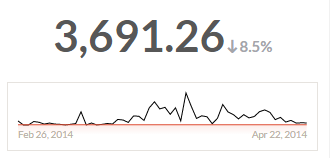
Metrics also display historical trends for the full data set after any filters are applied:
- trend shows the percentage difference in key indicator performance between the current calculation period and the previous period
- sparkline shows the trend of key indicator performance from the earliest calculation period to the current period, including optional trigger threshold lines
Note
You can create a metric with a single data point, however you need at least two data points for your calculation period to generate a sparkline or trend. The sparkline data points are calculation periods, so more than one period is required to show a historical trend.
If only one period exists, there is not enough data to generate a sparkline.
Sparkline display options
The following display options apply on the metrics page and in any storyboards that display the metric.
| Option | Description |
|---|---|
| Show sparkline |
Show or hide the sparkline for users that view the metric. |
| Show triggers |
Show or hide active trigger thresholds on the sparkline. |
Trigger order and threshold colors
Triggers execute sequentially from top to bottom, therefore the threshold color of the last trigger that evaluates to true is used to color the metric.
Monitoring metrics
Once you define a metric, you monitor the calculation for the current period by viewing the metric and toggling the triggers on or off. You can also include metrics in storyboards so that your results presentations display the current calculation and historical trends. For more information, see Creating storyboards.
Example
Your company sets a regulatory threshold of 10% for meal expense amounts that exceed a specific limit in each quarter. As part of your duties, you must monitor this regulatory requirement on an ongoing basis and report any quarters where more than 10% of meals exceed the limit of $50.00.
To monitor this threshold, you configure a Key Control Indicator by:
- Filtering the metric data on expense type so that only meal records are measured.
- Creating a new % of Amount metric that calculates the percentage of amounts that are greater than 50.00 per quarter.
- Setting a trigger to notify you when a threshold of greater than 10 is crossed.
If the percentage of meal expenses greater than $50.00 for the current quarter exceeds your company's threshold of 10%, the metric indicates that the regulatory threshold has been exceeded and you receive a notification email.
Note
If you don't receive the email notification, check your spam or junk folder.
Linking metrics to risks
After you create a metric, you can link it to risks in Strategy so that you can view the visualizations for key indicators such as KRIs within the relevant risks that your company has identified. You can also use linked metrics to automate risk assessments.
For more information, see Linking metrics to risks.