Using Storyboards
The Storyboards app is a powerful tool for visualizing and communicating complex data insights.
Where does storyboard content come from?
Storyboards display charts and tables from interpretations, as well as metrics. These are defined across Collections in Results. You can add any table, chart, or metric in Results that you have access to, except the Statistics chart.
Note
Once an item is added to the storyboard, changes automatically appear in the storyboard. You do not need to delete and re-add the item.
Drilling into storyboard data
When you have the Edit mode turned off, you can drill into each of the visualizations present in a storyboard if you have sufficient permission to access the visualization's data:
- Open a chart in a new tab to open a chart inside its interpretation in the Results app, hover over the chart and click the Drilldown icon

- Filter the data in the storyboard to filter chart data, click a data category in the chart legend to include or exclude the category
Tip
Use the drilldown and legend filters to make changes to your storyboard content on the fly.
Drilling into storyboard data with filters
When you drill down ![]() from a storyboard that has filters applied, these filters are carried over to the table in Results. You do not have to apply the same filters again. Filters applied in the storyboard will be carried over only if they affect the table / visualization that you drill down.
from a storyboard that has filters applied, these filters are carried over to the table in Results. You do not have to apply the same filters again. Filters applied in the storyboard will be carried over only if they affect the table / visualization that you drill down.
- If a visualization in your storyboard has no filter from the underlying interpretation, and you apply a filter in the storyboard and then drill down, the newly applied filter and the filter options are carried over to the interpretation. A storyboard icon
 appears next to the filter name, and the applied filter options are checked (
 ).
).
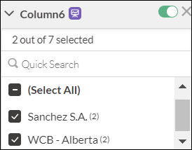
In the following screenshot, column6 is the filter name and Sanchez SA and WCB - Alberta are the filter options.
- If a visualization in your storyboard has a filter from the underlying interpretation and you reapply the same filter and filter options in the storyboard and then you drill down, there will be no change. The same filter and filter options show up in the interpretation after the drill down.
- If a visualization in your storyboard has a filter from the underlying interpretation and you apply the same filter in the storyboard, but make a few changes in the filter options such as applying some new options and leaving some options unchecked and then you drill down, the following things happen:
- The newly added filter options do not affect the data and are left unchecked, as they are already filtered out from the underlying interpretation. To learn more about filtered data, see Results filters vs storyboard filters.
- The unchecked filter options (that were applied in the underlying interpretation) are removed, and this is indicated by a minus sign
 and a storyboard icon
  appears next to these options.
In the following screenshot, WCB - Ontario is the unselected option, carried over from the drill down.
- The newly added filter options do not affect the data and are left unchecked, as they are already filtered out from the underlying interpretation. To learn more about filtered data, see Results filters vs storyboard filters.
For more information about filters in storyboards, see Filtering storyboards
Viewing storyboards in presentation mode
Use presentation mode to display a storyboard as full screen slides. Each tile from the storyboard is displayed as a slide, and you can use the arrow keys or forward and back icons to move through the presentation.
Tiles appear in the same order in the presentation as they do the storyboard.
-
From the Platform home page (www.diligentoneplatform.com), select the Storyboards app to open it.
If you are already in Diligent One, you can use the left-hand navigation menu to switch to the Storyboards app.
Note
Diligent One Platform also supports the domain www.highbond.com. For more information, see Supported domains.
- Click the storyboard you want to open.
- In the upper-right corner, click Presentation
 . The storyboard opens in a new tab of the browser. Each tile of the storyboard is displayed on a single slide, starting with the title.
 - Use the arrow keys or forward and back icons to move between slides. The forward and back icons are located in the lower-right corner.
Tip
Press the Esc key to zoom out of the presentation and see all your slides at once. You can then choose the one you want to view and press the Enter key.
Filling visualizations with a pattern
You can fill visualizations in a storyboard with design patterns, in place of colors. You can do this by using the toggle option in the upper-right corner of a storyboard (More options ![]() > Pattern fill).
> Pattern fill).
When you turn on the pattern fill, the charts in the storyboard are redrawn with carefully chosen, distinct patterns. This is helpful to people who find it difficult to distinguish between colors.
A few points to be noted:
- When you turn on the Pattern fill toggle in a storyboard, the setting is saved in the web browser and any storyboard viewed from the same browser will show pattern-filled charts. Note that when you clear the browser history, this setting will also get cleared and you will have to turn on the Pattern fill toggle again.
- The pattern is chosen automatically, you cannot alter it manually.
- Pattern fill is reflected in presentation mode
 also.
also. - Pattern fill will not work:
- For chart types that use a color gradient such as a heat map.
- When you view the visualization in the Results app.
- When Boost performance is turned on and the chart contains more than 150 data points.
Examples
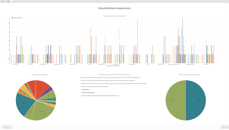
Example: unauthorized transactions
You have just completed an accounts payable audit for your finance team, and you need to communicate your findings to an executive body. To present your findings, you include three key charts from your results data and include a textual narrative in the storyboard to inform your audience:

Example: demonstrating compliance with a SOX framework
A publicly traded company needs to be in compliance with a SOX framework in order to satisfy regulators and external audit. To demonstrate compliance with the SOX framework, audit leader Sam creates a storyboard to showcase the overall outcome of controls tested. To do this, Sam:
- Imports his Projects Control Test into Analytics.
- Imports his Analytics data into Results.
- Creates a bar chart and a line chart visualization to show how financial statements are not impacted.
- Adds the visualizations to a storyboard and provides context and insight from the outcome of the internal controls audit.
The storyboard enables business process owners, management, and external auditors to maintain their course of action.
Example: travel and entertainment audit
A company decides to cut operating costs and decides to lower administrative and travel expenses. To do this, a Travel and Entertainment policy is created to maintain a budget of $20 million with 5% of the budget allocated to employees for operational expenses.
Laura, a Manager, conducts a 12-month audit and finds that employees consistently exceeded their spending on work-related travel and violated existing policies. Excess spending is reimbursed through the company expense system.
Laura uses a Storyboard to communicate how personal expense claims are violating the Travel and Entertainment policy. She includes several different charts, including an aggregated pie chart that shows employee expenses by month.