Bar chart
A bar chart is a graph with rectangular bars. Each bar's length is proportional to the value it represents. Use bar charts to compare two or three variables using a single value.
When do you use it?
Basic bar charts
Bar charts are useful for comparing categories: the x-axis represents the category and the y-axis represents the value to compare.
Tip
You can also use a basic bar chart to create a histogram that displays the distribution of x-axis data. Histograms display the frequency of each unique value in the selected x-axis field as a bar that is proportional to the value.
Complex bar charts
Bar charts can represent more complex categories using grouped or stacked bars. Grouped or stacked bar charts use a third variable to sub-divide the comparison category:
| Icon | Type | Description |
|---|---|---|
|
|
Grouped | Third dimension values are displayed as adjacent bars or columns within the second dimension value. |
|
|
Stacked | A single second dimension bar or column is divided by the third dimension values. |
|
|
100% Stacked | A single dimension bar or column is divided by the percentage each third dimension value contributes to the total. |
Examples
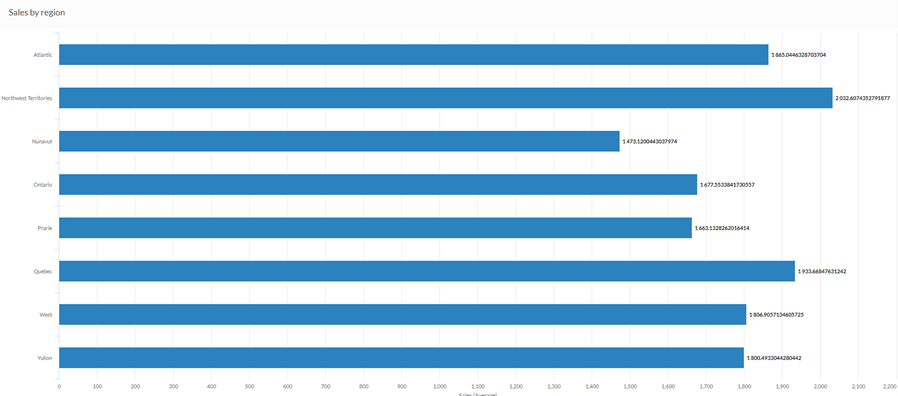
Bar chart
Your company is tracking sales data and needs to determine which regions are enjoying the highest sales numbers. Using a bar chart, you visualize the sales numbers and clearly demonstrate how each region is performing:
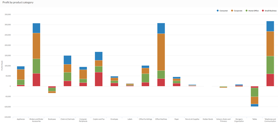
Stacked column chart
Your company is tracking sales data and needs to determine which product categories are returning a negative profit.
Using a stacked column chart, you visualize the sales numbers and clearly demonstrate which product categories are performing well, and which are not. Stacking the third dimension also helps you determine which segment of each category is most responsible for the overall totals:
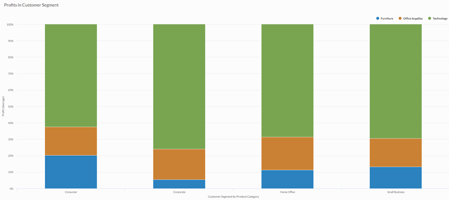
100% stacked column chart
You are performing an analysis of profits by customer segment. You want to visualize the proportion of each product category within the average profit of each customer segment.
To do this, you use a 100% stacked column chart that displays the percentage each product category contributes to the customer segment value:
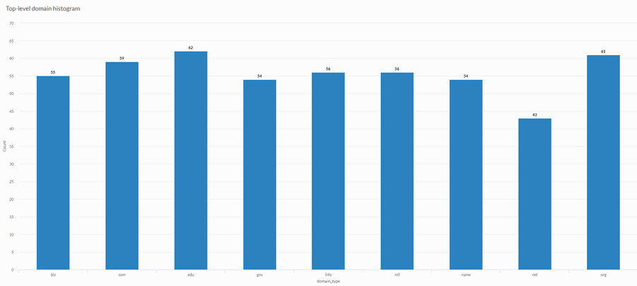
Histogram
You are performing an analysis of customer web sites and you want to display the frequency of top-level domains used in the collection of sites. To do this, you use a histogram that displays the count of each unique top-level domain value in your table:
Data configuration settings
-
From the Platform home page (www.diligentoneplatform.com), select the Results app to open it.
If you are already in Diligent One, you can use the left-hand navigation menu to switch to the Results app.
Note
Diligent One Platform also supports the domain www.highbond.com. For more information, see Supported domains.
- Navigate to the appropriate table.
- On the Configure
 panel, click Data and configure the following settings:
| Setting | Supported data types | Description |
|---|---|---|
|
X-Axis |
|
The field to use as the basis for the chart's horizontal scale. One bar is created for each unique value in the field, or each unique combination of values if you also specify a Color by field. |
|
Y-Axis |
numeric |
The aggregate value represented by the chart's vertical axis. You can select a count of the x-axis field or one of several aggregate values for a different numeric column in the table:
Tip Use the Count option to create a histogram that displays the distribution of data for the x-axis. Tip You can control decimals and rounding on numeric data by changing format of this field. For the Average aggregate option, Format options is available in the Data tab of the Configure Visualization panel. For all other aggregate options, format options set in Table View is applied. For help doing this, see Data formatting options. |
|
Color by optional |
character |
The field represented by the third data dimension to the chart. Adding a third data dimension can sub-divide x-axis categories. You can think of the Color by field as a break field. |
|
Format options |
numeric |
Select an option in this field to apply formatting such as decimals and rounding to the Y-axis values in the chart. For help doing this, see Data formatting options. Format options is available only for the Average aggregate option. For all other aggregate options, format options set in Table View is applied. |
Chart display settings
-
From the Platform home page (www.diligentoneplatform.com), select the Results app to open it.
If you are already in Diligent One, you can use the left-hand navigation menu to switch to the Results app.
Note
Diligent One Platform also supports the domain www.highbond.com. For more information, see Supported domains.
- Navigate to the appropriate table.
- On the Configure panel, click Display and configure the following settings:
| Setting | Description |
|---|---|
| Options | |
| Show Legend | Show or hide the legend at the top of the chart. |
| Show Values | Show or hide the data point values. |
| Rotate Horizontal | Display the bar chart with the x-axis on the left-hand side of the chart and the y-axis running horizontally along the bottom of the chart. |
| Show Percentages |
Show or hide the percentage that each proportion represents of the whole.
|
| Boost performance |
Switches into performance mode when data points on the chart go beyond 150 by applying some trade-offs. For more information, see Boost performance of charts. |
| Chart Type |
How to display the third dimension of the chart (Color by):
|
| X-Axis | |
| Show Label | Show or hide the label for the x-axis. |
| Y-Axis | |
| Show Label | Show or hide the label for the left y-axis. |
| Min | The minimum value to use for the left y-axis. By default, the chart uses the lowest value of the left y-axis data to determine the minimum. |
| Max | The maximum value to use for the left y-axis. By default, the chart uses the highest value of the left y-axis data to determine the minimum. |
| Other settings | |
| Colors | The colors assigned to each series in the Color by dimension. |
Chart sorting settings
-
From the Platform home page (www.diligentoneplatform.com), select the Results app to open it.
If you are already in Diligent One, you can use the left-hand navigation menu to switch to the Results app.
Note
Diligent One Platform also supports the domain www.highbond.com. For more information, see Supported domains.
- Navigate to the appropriate table.
- On the Configure panel, click Sort and configure the following settings:
Setting Description Options Sorting Sorts the data categories by ascending or descending total value, by default (alphabetically), or in custom order. To apply a custom order, click and drag the values in the Sort tab into the necessary order.