Combination chart
A combination chart is a graph which shows two types of charts in a single graph. Two different sets of data which are related to a common point can be represented on a single graph using the combination chart. This consists of a line chart overlaid on a column chart. A combination chart can have dual Y-axis to represent two different scales of measurement. You can enable the dual Y-axis in the chart display settings.
When do you use it?
A combination of bars and lines in the same visualization can be useful when comparing values in different categories since the combination gives a clear view for comparison. For example, using the combination chart to compare projected sales with the actual sales for different time periods.
Combination charts are useful where you want to validate relationship between two variables that have different scales of measurement but are related to a common point. For example, when two charts share a common category X-axis (e.g. Region) and may have more than one quantitative Y-axis, each representing a different scale of value (e.g. Revenue and Profit).
Tip
Combination charts are most useful for following trends and identifying deviation in the data that may require further investigation.
Examples
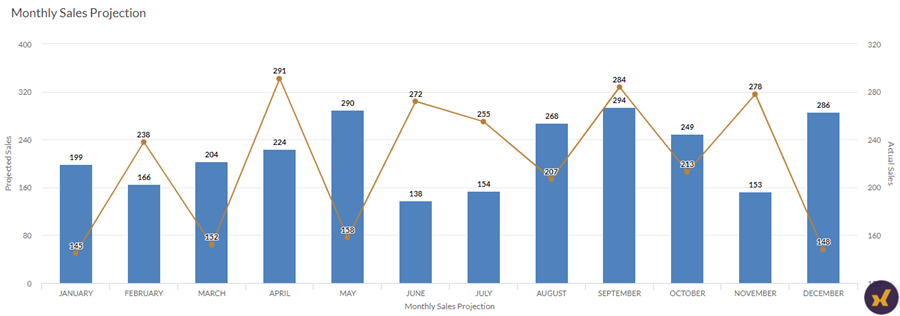
Simple combination chart
Your company is tracking sales data and needs to determine the trend of the monthly Projected Sales versus Actual Sales numbers. Using a simple combination chart with dual axes, you can visualize the sales numbers and clearly demonstrate the trend for the given period.
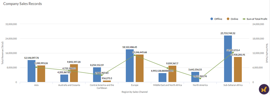
Grouped combination chart
Your company is tracking sales data and needs to determine the total revenue generated versus the total profit gained by each region, the region grouped by the sales channel i.e. offline versus online.
Using a grouped combination chart with dual axes, you can visualize the total revenue and profit numbers and clearly demonstrate the trend comparison over different regions. Grouping also helps you determine revenue generated by each sales channel.
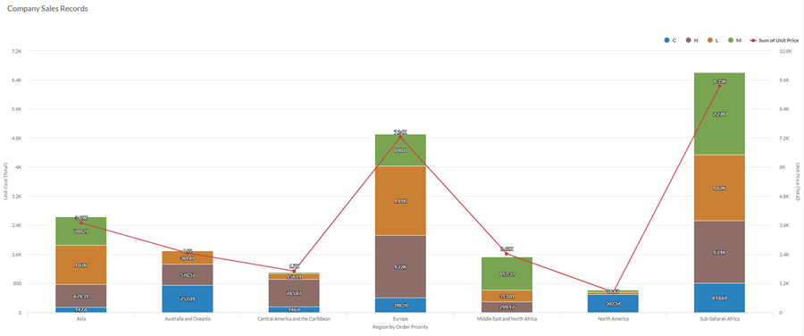
Stacked combination chart
Your company is tracking sales data and needs to determine the Unit Cost versus the Unit Price of the items in the warehouse by region, the region stacked by Order Priority of the items i.e. critical, high, low, and medium.
Using a stacked combination chart with dual axes, you can visualize the Unit Cost versus the Unit Price of the items and clearly demonstrate the trend comparison over different regions. Stacking also helps you determine Unit Cost by Order Priority.
Data configuration settings
-
From the Platform home page (www.diligentoneplatform.com), select the Results app to open it.
If you are already in Diligent One, you can use the left-hand navigation menu to switch to the Results app.
Note
Diligent One Platform also supports the domain www.highbond.com. For more information, see Supported domains.
- Navigate to the appropriate table.
- On the Configure
 panel, click Data and configure the following settings:
| Setting | Supported data types | Description |
|---|---|---|
|
X-Axis |
|
The field to use as the basis for the chart's horizontal scale. One bar is created for each unique value in the field, or each unique combination of values if you also specify a Color by field. |
|
Y-Axis Column |
numeric |
The aggregate value represented by the chart's vertical axis. You can select a count of the x-axis field or one of several aggregate values for a different numeric column in the table:
Tip Use the Count option to create a histogram that displays the distribution of data for the x-axis. Tip You can control decimals and rounding on numeric data by changing format of this field. For the Average aggregate option, Format options is available in the Data tab of the Configure Visualization panel. For all other aggregate options, format options set in Table View is applied. For help doing this, see Data formatting options. |
|
Y-Axis Line |
numeric |
The aggregate value represented by the chart's vertical axis. You can select a count of the x-axis field or one of several aggregate values for a different numeric column in the table:
The position of data points on the vertical scale determines the height of each line. The height of a line is interpolated or gapped if a data point is missing. Tip You can control decimals and rounding on numeric data by changing format of this field. For the Average aggregate option, Format options is available in the Data tab of the Configure Visualization panel. For all other aggregate options, format options set in Table View is applied. For help doing this, see Data formatting options. |
|
Color by optional |
character |
The field represented by the third data dimension to the chart. Adding a third data dimension can sub-divide x-axis categories. You can think of the Color by field as a break field. |
|
Format options |
numeric |
Select an option in this field to apply formatting such as decimals and rounding to the Y-axis values in the chart. For help doing this, see Data formatting options. Format options is available only for the Average aggregate option. For all other aggregate options, format options set in Table View is applied. |
Chart display settings
-
From the Platform home page (www.diligentoneplatform.com), select the Results app to open it.
If you are already in Diligent One, you can use the left-hand navigation menu to switch to the Results app.
Note
Diligent One Platform also supports the domain www.highbond.com. For more information, see Supported domains.
- Navigate to the appropriate table.
- On the Configure panel, click Display and configure the following settings:
| Setting | Description |
|---|---|
| Options | |
| Show Legend | Show or hide the legend at the top of the chart. |
| Show Values | Show or hide the data point values. |
| Round Edges | Smooths out the transitions between data points to create a curved line chart. |
| Boost performance |
Switches into performance mode when data points on the chart go beyond 150 by applying some trade-offs. For more information, see Boost performance of charts. |
| Column Type |
How to display the third dimension of the chart (Color by):
|
| X-Axis | |
| Show Label | Show or hide the label for the x-axis. |
| Y-Axis (Left) | |
| Show Label | Show or hide the label for the left y-axis. |
| Min | The minimum value to use for the left y-axis. By default, the chart uses the lowest value of the left y-axis data to determine the minimum. |
| Max | The maximum value to use for the left y-axis. By default, the chart uses the highest value of the left y-axis data to determine the minimum. |
| Show dual Y-Axis | Show or hide the Y-Axis (Right). |
| Y-Axis (Right) | |
| Show Label | Show or hide the label for the right y-axis. |
| Min | The minimum value to use for the right y-axis. By default, the chart uses the lowest value of the right y-axis data to determine the minimum. |
| Max | The maximum value to use for the right y-axis. By default, the chart uses the highest value of the right y-axis data to determine the minimum. |
| Other settings | |
| Colors | The colors assigned to each series in the Color by dimension. |
Chart sorting settings
-
From the Platform home page (www.diligentoneplatform.com), select the Results app to open it.
If you are already in Diligent One, you can use the left-hand navigation menu to switch to the Results app.
Note
Diligent One Platform also supports the domain www.highbond.com. For more information, see Supported domains.
- Navigate to the appropriate table.
- On the Configure panel, click Sort and configure the following settings:
Setting Description Options Sorting Sorts the data categories by ascending or descending total value, by default (alphabetically), or in custom order. To apply a custom order, click and drag the values in the Sort tab into the necessary order.
Note
Sorting is applied based on the column values