Line chart
Line charts show trends or changes over time by displaying a series of data points connected by straight line segments. You can display a single data field as multiple lines based on different categories through Color by field.
When do you use it?
Use line charts to track changes over short or long periods of time and to assist in predictive data analysis. If small, frequent changes exist in the series, line charts are more effective than bar charts at visualizing the change over time.
Line charts are also useful for comparing changes over the same period of time for multiple groups or categories.
Tip
Use independent variables such as time or dates on your line chart's x-axis and dependent numeric variables on the y-axis.
Examples
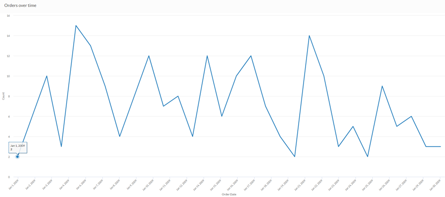
Simple line chart
Using last month's sales data, you want to show the trend of orders placed over time. To do this, you use a line chart that plots the count of orders:
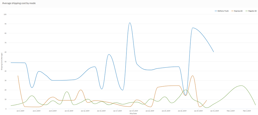
Curved multiseries line chart
Using last month's sales data, you want to show the trend of average shipping cost for each shipping method your company employs. To do this, you use a line chart that groups each series by shipping method:
Data configuration settings
-
From the Platform home page (www.diligentoneplatform.com), select the Results app to open it.
If you are already in Diligent One, you can use the left-hand navigation menu to switch to the Results app.
Note
Diligent One Platform also supports the domain www.highbond.com. For more information, see Supported domains.
- Navigate to the appropriate table.
- On the Configure
 panel, click Data and configure the following settings:
| Setting | Supported data types | Description |
|---|---|---|
| X-Axis |
|
The field to use as the basis for the chart's horizontal scale. Using a character field as the basis for the x-axis allows you to display a line chart that shows X number of comparisons for a given Y value aggregate. This is especially useful when combined with the Color by option, which allows you to display separate lines, differentiated by color, for each selected field. Character fields along the x-axis are sorted in alphabetical order by default. |
|
Y-Axis |
numeric |
The aggregate value represented by the chart's vertical axis. You can select a count of the x-axis field or one of several aggregate values for a different numeric column in the table:
The position of data points on the vertical scale determines the height of each line. The height of a line is interpolated or gapped if a data point is missing. Tip You can control decimals and rounding on numeric data by changing format of this field. For the Average aggregate option, Format options is available in the Data tab of the Configure Visualization panel. For all other aggregate options, format options set in Table View is applied. For help doing this, see Data formatting options. |
|
Color by (optional setting) |
character |
The field represented by the third data dimension to the chart. Adding a third data dimension creates the categories represented by lines. A separate line is created for each unique value in the field. |
|
Format options |
numeric |
Select an option in this field to apply formatting such as decimals and rounding to the Y-axis values in the chart. For help doing this, see Data formatting options. Format options is available only for the Average aggregate option. For all other aggregate options, format options set in Table View is applied. |
Chart display settings
-
From the Platform home page (www.diligentoneplatform.com), select the Results app to open it.
If you are already in Diligent One, you can use the left-hand navigation menu to switch to the Results app.
Note
Diligent One Platform also supports the domain www.highbond.com. For more information, see Supported domains.
- Navigate to the appropriate table.
- On the Configure panel, click Display and configure the following settings:
| Setting | Description |
|---|---|
| Options | |
| Show Legend | Show or hide the legend at the top of the chart. |
| Show Values | Show or hide the data point values. |
| Round Edges | Smooths out the transitions between data points to create a curved line chart. |
| Interpolate |
Handle missing data points by connecting the line using the available data points, but do not plot the missing data point on the x-axis. If disabled, the line is not connected across missing data points. |
| Boost performance |
Switches into performance mode when data points on the chart go beyond 150 by applying some trade-offs. For more information, see Boost performance of charts. |
| X-Axis | |
| Show Label | Show or hide the label for the x-axis. |
| Y-Axis | |
| Show Label | Show or hide the label for the left y-axis. |
| Min | The minimum value to use for the left y-axis. By default, the chart uses the lowest value of the left y-axis data to determine the minimum. |
| Max | The maximum value to use for the left y-axis. By default, the chart uses the highest value of the left y-axis data to determine the minimum. |
| Other settings | |
| Colors | The colors assigned to each series in the Color by dimension. |