Visualizing report data using charts
In the Reports app, you can visualize data to gain a deeper understanding of the facts and insights hidden in the data. You can add a chart to a report to highlight data trends, outliers, or patterns.
You can also visualize data using charts in the Results app. For more information, see Visualizing table data in charts.
How it works
A chart is a graphic representation of a tabular data set. When you have finalized the data that you want to include in your report, you can begin adding charts to visualize data. The chart data correlates to the data defined in the table of the report.
Once you have added charts to the report, you can display the charts using a variety of presentation platforms, such as multi-chart canvases, dashboards, and presents.
Changing report data and switching table layouts
Best practice is to finalize your data and table layout first on the Data tab, and then add charts to the report on the Charts tab.
If the layout of the table in your report is configured as Column or Row, and you decide to switch to a Cross Tab layout, any charts you previously created are permanently deleted.
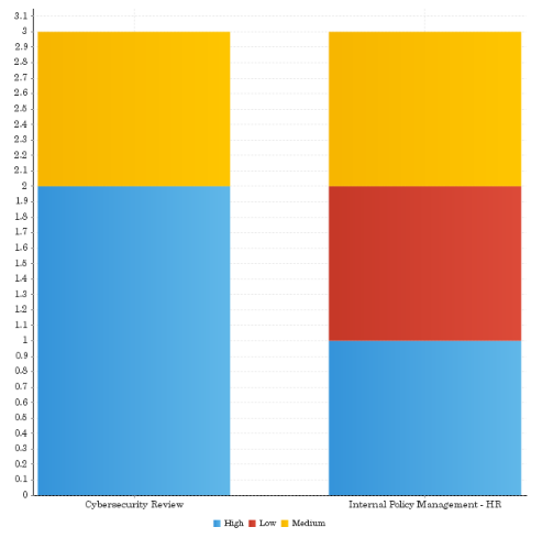
Example
Stacked Vertical Bar chart
Scenario
You want to visualize issue severity data for two different projects:
- Cybersecurity Review
- Internal Policy Management - HR
Process
You create a Stacked Vertical Bar chart that displays the number of issues by severity per project.
Result
Permissions
Only Report Admins or Report Writers can add charts to reports.
Create a report
-
From the Platform home page (www.highbond.com), select the Reports app to open it.
If you are already in Diligent One, you can use the left-hand navigation menu to switch to the Reports app.
- Complete one of the following actions:
- Create a new report select Create > Report.
For more information, see Create a new report.
- Copy a report or report template right-click the report or report template on the Browse page, and select Make a Copy.
- Create a new report select Create > Report.
Create a chart
- Click the Charts tab.
- Do one of the following:
- To begin creating a chart, and allow Reports to automatically detect the chart type, leave Auto Chart selected.
Auto Chart displays chart building areas for common chart types such as Bar, Column, Analytical, and Line charts, that can be populated with fields. The chart that generates depends on the fields you drag into these areas.
NoteAuto Chart is not compatible with Cross Tab reports. You must select a specific chart type if you are working with a Cross Tab report.
- To select a specific chart type, click
 in the upper-right corner, and select the appropriate chart you want to create from the Select Chart side panel.
For more information, see Choosing the right chart in Reports.
TipYou can switch to a different chart type at any stage in the chart creation process to see how your data can be visualized.
- To begin creating a chart, and allow Reports to automatically detect the chart type, leave Auto Chart selected.
- Drag the fields you want to include in the chart to the appropriate areas.
You can only select from fields that have been included in the Data tab.
- To define field settings, sorting, and aggregations, hover your mouse over the appropriate field, click the down arrow
 , and configure any of the following:Note
The options available depend on whether you are working with a Dimension, Metric or Date field, and the type of chart you are creating.
Option Description Settings specifies the color of the selected series of data Aggregation Type applies an aggregation function the field in the chart, which can be different from the aggregation function applied to the same field in the table
The Default Aggregation option applies the same aggregation function used on the field in the table.
NoteThe following charts do not support aggregation functions: Scatter, Histogram, Box & Whisker, Z Chart, Meter charts, Digital Numeric Display, Event, and any charts with conditional formatting applied.
Color specifies the color of a previously defined metric
This option is only available on metric fields in charts that do not have a color defined by a category or different metric field.
Axis Settings defines custom settings for the lines bordering the chart plot area that are used as a frame of reference for measurement
The y axis is usually the vertical axis and contains data. The x-axis is usually the horizontal axis and contains categories.
Time Series turns on time series functionality to allow you to present a series of data points, and show gaps in data based on defined time intervals Sort By defines how chart data is sorted:
- Alphanumeric sorts chart data by alphanumeric values in the selected field
- Data Order sorts chart data based on the same sorting applied to the table in the report
- Group Order sorts chart data based on the same group sorting applied to the table in the report
- Series sorts chart data by the values in a specified chart series
By default, data in charts is sorted based on the sorting applied to the table in the report. You can only sort one field in a chart at a time.
Sort defines the direction of sorting for chart data
By default, chart data is sorted based on the sorting applied to the table in the report.
Add Function defines a new field in the chart, which is based on an aggregated field defined in the table of the report
For more information, see Using function fields in charts.
- To apply an advanced function to a field in the chart, click Advanced Function
 .
.The advanced function can be different from the one applied to the same field in the table. For more information, see Applying advanced functions.
Format a chart
- Click on the thumbnail of the appropriate chart at the bottom of the screen.
- Format the chart using any of the available options in the chart formatting toolbar:
 Note
NoteThe options available in the chart formatting toolbar depend on the type of chart you are creating.
Formatting option Description  Reset
Resetresets your chart or formatting applied:
- Reset Formatting resets your formatting selections, but keeps the chart type and field selections defined
- Reset Chart resets your chart, including all formatting, field, and chart type selections, returning it to an empty state
 Chart Settings
a series of dynamic options that are based on the type of chart selected  Title
Titlechanges the title of the chart as well as the style, such as the font settings  Legend
includes a legend in your chart that identifies the patterns or colors that are assigned to the data series or categories in a chart  Axis
Axisprovides options for formatting the x and y axis, and the lines bordering the chart plot area, which are used as a frame of reference for measurement  Background
sets the style and color of the main chart elements such as the plot and chart areas
You can use these options to apply elements such as background images and or gridlines to a chart.
NoteGridline settings are not available for Meter and Pie charts, and are only available for selective Analytical charts and Special Purpose charts.
 Labels
adds labels to a chart to print out the values of the data points  Series
specifies the colors and border style that display within a chart
For more information, see Formatting chart colors.
Copy a chart
- Click on the thumbnail of the appropriate chart at the bottom of the screen.
- In the right corner of the thumbnail, click
 and select Copy.
The copied chart displays.
Add multiple charts to a report
- Click Add Chart
 at the lower-right corner of the Chart Builder.
 - For each chart, follow steps 2-4 under Create a chart.
Edit or delete a chart
Do one of the following:
- Edit a chart click on the thumbnail of the appropriate chart at the bottom of the screen, and configure data and formatting as needed.
- Delete a chart click on the thumbnail of the appropriate chart at the bottom of the screen, click in the right hand corner of the thumbnail, click Delete, and click Yes to confirm.
Save the report
- Click the Publish tab.
The Save Report dialog box opens.
- In the Details tab:
- Enter a name and description for the report.
- Define where the report will be stored by selecting the appropriate content folder and content sub folder.
- Optional. Click + Add tags to create tags that classify the report, or select any existing tags to associated with the report.Tip
You can use tags to quickly filter reports on the Browse page.
- Specify the access level required for the report:
- Public all users that have access to the content sub folder the report is stored in will have access to the report
- Private allows you to define specific people and / or groups that can access the report
The User Access tab displays, and allows you to define the people / groups that can access the report.
- In the Distribution tab, specify how the report can be distributed:
- Broadcast allows you to broadcast the report to yourself or other people by email
- Email allows you to distribute the report by email
- Email & Broadcast Security if Broadcast or Email is selected, this option allows you to specify the level of access required for people to be able to receive the report by email
- All Users all Reports users can receive the report via email
- Unsecure the report can be sent to external stakeholders that do not have access to the Reports app
- Validated Users all users with folder access to the dashboard tab can receive the report via email
NoteThe Web Services option is currently not supported.
- In the Export tab, specify the settings for the export options:
- Default use the default settings defined in the report configuration
- On turn on the export option
- Off turn off the export option
- In the Report Settings tab, specify if the report can be made visible on the Browse page, and if the report can be added to dashboards.
- Save the report as a draft or activate the report to make it available to other people:
- Save > Activate saves the report and makes it available to users with the appropriate access
Once you activate a report, you can email the report, and add the report to a dashboard or presentation.
NoteIf User Access settings in the sub folder have been set to Expert approval required to publish, select Save > Request Approval.
- Save > Draft saves the report and does not make it available to users assigned the Report Writer or Report Reader role
- Save > Activate saves the report and makes it available to users with the appropriate access