Choosing the right chart in Reports
Learn about the available chart types, data visualization best practices, and how to choose the right chart that suits your needs.
You can also visualize data using charts in the Results app. For more information, see Visualizing table data in charts.
Available chart types
Analytical charts typically present patterns in complex data sets.
For more information, see Analytical charts in Reports.
| Icon | Chart name | Description |
|---|---|---|
|
|
Scatter | shows the relationship between two sets of data and can only be used if the data series are related |
|
|
Treemap | compares metric values to show hierarchical relationships |
|
|
Histogram | shows the number of times a given value occurs in the data set |
|
|
Box and Whisker | shows a quick overview of a series of values and their statistical properties |
|
|
Trellis |
a layout of smaller charts in a grid with consistent scales Each chart represents an item in a category. |
|
|
Heat Grid | plots the intensity of a metric across multiple categories |
Area charts typically use three data dimensions, or variables, to compare trends or changes over time for two or more categories.
For more information, see Area charts in Reports.
| Icon | Chart name | Description |
|---|---|---|
|
|
Area | displays graphically quantitative data that typically compares two or more quantities |
|
|
Stacked Area | typically compares trends or changes over time for two or more categories, and also shows the proportion of the total that each category represents at any given point in time |
Bar charts are graphs with rectangular bars. Each bar's length is proportional to the value it represents. Use bar charts to compare two or three variables using a single value.
For more information, see Bar charts in Reports.
| Icon | Chart name | Description |
|---|---|---|
|
|
Horizontal Bar | displays horizontal lengths proportional to the values they represent |
|
|
3D Horizontal Bar | similar to the Horizontal Bar chart, but in a three-dimensional format |
|
|
Stacked Horizontal Bar | displays the relationship of individual items to the whole |
|
|
Horizontal Cylinder | similar to the Horizontal Bar chart, but has chart components shown in cylindrical form |
|
|
Proportional Bar | displays how close values in different categories are to the maximum category value |
|
|
Layered Bar | compares the contribution of each value to a total across categories |
Column charts display data using vertical bars.
For more information, see Column charts in Reports.
| Icon | Chart name | Description |
|---|---|---|
|
|
Vertical Column | displays vertical lengths proportional to the values they represent |
|
|
3D Vertical Column | similar to the Vertical Bar chart, but in a three-dimensional format |
|
|
Stacked Vertical Column | displays the relationship of individual items to the whole |
|
|
Cylinder | similar to a Vertical Bar chart, but has components shown in cylindrical form |
|
|
3D Stacked Column | similar to a 3D Stacked Vertical Bar chart, but in three-dimensional format |
|
|
Layered Column | compares the contribution of each value to a total across categories |
Combination charts superimpose one chart type above or below another.
For more information, see Combination charts in Reports.
| Icon | Chart name | Description |
|---|---|---|
|
|
Vertical Combined | You want to highlight values for easy comparison and plot your numbers vertically. Use these to place less emphasis on time and focus on comparing values. |
|
|
Vertical Overlay | Use the line chart to emphasize a trend and bars to emphasize specific values. Line / Bar combinations may work better by de-emphasizing bars through the use of subtle colors. |
|
|
Horizontal Overlay | Use the line chart to emphasize a trend and bars to emphasize specific values. Line / Bar combinations may work better by de-emphasizing bars through the use of subtle colors. |
|
|
Horizontal Combined | Combination charts, in effect, superimpose one chart type above or below another. Use to improve clarity and highlight relationships between data sets. |
These are commonly used in the financial sector, specifically designed to show trends and movements in trading datasets.
For more information, see Financial charts in Reports.
| Icon | Chart name | Description |
|---|---|---|
|
|
Financial Line | Use this chart to display a trading value with a subchart displaying volume. |
|
|
High Low | Displays the daily high, low, opening, and closing values with tick positions corresponding to opening and closing values. |
|
|
Candlestick | Shows the daily high, low, opening, and closing values with different colour bars depending on the daily direction (positive or negative). |
Line charts show trends or changes over time by displaying a series of data points connected by straight line segments. You can display one or more series in a line chart.
For more information, see Line charts in Reports.
| Icon | Chart name | Description |
|---|---|---|
|
|
Line | typically shows or compares trends or changes over time for one or more categories |
|
|
3D Line | similar to a Line chart, but in three-dimensional format |
|
|
Z-Chart | displays the data, cumulative total, and moving total and is used for representing trends over a short period of time |
|
|
Stepped | displays trends or changes over time in the form of steps |
Meter charts display a single variable, and may use colors to indicate whether the current value is in the regular, warning, or critical range.
For more information, see Meter charts in Reports.
| Icon | Chart name | Description |
|---|---|---|
|
|
Meter | measures the rate of change against pre-defined targets |
|
|
Thermometer | a vertical representation of a meter chart that indicates a range of qualitative indicators |
|
|
Dial | used to communicate KPIs (Key Performance Indicators) |
Pie charts show categories as a proportion or a percentage of the whole. Use pie charts to show the composition of categorical data with each segment proportional to the quantity it represents.
For more information, see Pie charts in Reports.
| Icon | Chart name | Description |
|---|---|---|
|
|
Pie | shows categories as a proportion or a percentage of the whole |
|
|
3D Pie | similar to a Pie chart, but in three-dimensional format |
|
|
Multi Pie | used to highlight individual component sizes in a system of multiple components |
|
|
Ring | similar to a Pie chart, but with a white space in the middle of the chart |
Special Purpose charts enable you to report on multivariate data.
For more information, see Special Purpose charts in Reports.
| Icon | Chart name | Description |
|---|---|---|
|
|
Funnel Chart | often used to represent stages in a sales process, and to identify potential problem areas in an organization's sales process |
|
|
Proportional Infographic | displays segments on an image, with the segment size representing metric value |
|
|
Comparative Infographic | displays a series of images sized to correspond with the values of a given metric |
|
|
Radar | displays multivariate data in the form of a two-dimensional chart of three or more quantitative variables on axes starting from the same point |
|
|
Waterfall | displays the cumulative effect of sequentially introduced positive or negative values |
|
|
Event | used to map the occurrence of events against the values of a numeric data set over time |
|
|
Week Density | used to display the density of an occurrence or metric value based on an hour, relative to other times in the same day of the week |
|
|
Digital Numeric Display | displays the value of a metric on a digital display |
|
|
Numeric Display | shows the total value of the field |
Maps are currently not supported.
Data visualization best practices
Data visualizations are essential to helping people understand the story within the data. Placing the data in a visual context helps patterns, trends, and correlations emerge that might otherwise go unnoticed.
To make sure your data visualizations tell compelling stories, follow these best practices.
Know your audience
Before you start designing a data visualization, consider who the primary audience is for the visual representation of the data.
Make sure the visualization answers the questions that are most important to the primary audience. Resist the temptation to create visualizations that meet the needs of any and all potential audiences as this may make the message for your intended audience less clear.
To design for your audience, ask yourself these key questions:
- who is my primary audience?
- how will my audience view this visualization?
- what actions do I want the audience to take based on this data?
Provide context
Data trends and patterns are best demonstrated in the context of larger goals and metrics. By presenting your data visualizations within context, a better story emerges from your data and stakeholders can draw clearer conclusions:
- use color to imply meaning
- compare data to metrics or goals
- ensure data periods are clearly indicated
Associating color with meaning
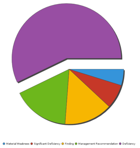
You need to provide a visualization that displays the percentage of open issues by type. To visualize this data, you choose a pie chart and then use color to associate the different issue types with meaning:
- Blue Material Weakness
- Red Significant Deficiency
- Yellow Finding
- Green Management Recommendation
- Purple Deficiency
This color to word association make it easy for your audience to understand the overall meaning of the data without having to study the details closely.
Keep it simple and clear
Your audience has a short attention span. If your visualization cannot be clearly understood within 10 to 15 seconds, your audience may miss the point. Use the following tips to simplify your visualizations and improve clarity:
- use white space to make labels and chart components distinct
- write descriptive labels and headings so that nothing is ambiguous
- align chart colors with the meaning you are trying to convey
- keep text short and simple so it is easy to read
- tell one story at a time to avoid confusing your audience
Understand your data
There are three types of data you may encounter when building visualizations:
- categorical data that belongs together logically but has no intrinsic ordering (department: sales, human resources, IT, etc.)
- ordinal data that belongs together logically and has an intrinsic ordering (education: high school, some college, college graduate, etc.)
- quantitative data that defines a quantity, or how much, of something there is (transaction amount: $100, $175, $400 etc.)
What kind of data are you trying to visualize? Knowing the data you are working with makes choosing the right chart type and communicating meaning an easier proposition.
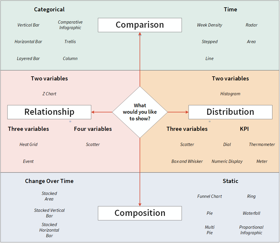
Choose the right chart
Once you understand your audience and your data, it is time to select the chart that best expresses the story in the data:
Next step...create a chart
For information about creating any of the charts available to you, see Visualizing report data using charts.